Everything Photoshop Subscribe

Creating an Old-Collage Effect Poster

In Designing by Collis
One of my favourite 'looks' is the sort of old-collage feel of old photos and old paper. It's a favourite because it lets you work images and text together really easily. In this tutorial we'll put together a poster where there is a main photograph and a lot of text using the old-collage feel.

Step 1

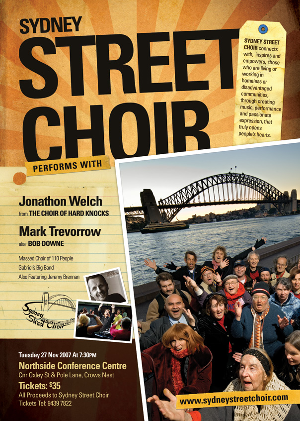
This tutorial is based on a job I did a few days ago for a charity client who needed a poster to promote an upcoming event. They are a choir made up of homeless people called the Sydney Street Choir and it's a pretty neat little organisation which you can learn about at www.sydneystreetchoir.com. The brief was to promote the event use this really nice photo (shown) of the choir down by the Sydney Harbour Bridge shot by John Marmaras and to include some written copy which I've shown below the image.

Unfortunately there is a lot of text to go on the poster and although this image is gorgeous, it is very busy, so using the photo as the background for the poster would present problems in getting all that text working over the top. I know this is a problem, because I spent an hour trying to make it work before deciding that I should try something else!

The Text...

www.sydneystreetchoir.com
SYDNEY STREET CHOIR
Performs With

Jonathon Welch
from THE CHOIR OF HARD KNOCKS

Mark Trevorrow
aka BOB DOWNE

Massed Choir of 110 People
Gabriel’s Big Band
Also Featuring Jeremy Brennan

Tuesday 27 Nov 2007 At 7:30PM
Northside Conference Centre
Cnr Oxley St & Pole Lane, Crows Nest
Tickets: $35
All Proceeds to Sydney Street Choir
Tickets Tel: 9439 7822

SYDNEY STREET CHOIR connects with, inspires and empowers, those who are living or working in homeless or disadvantaged communities, through creating music, performance and passionate expression, that truly opens people’s hearts.

Step 2

So if the photo-as-poster model isn't going to work, then we need another look. I decided to put together what I call the old-collage feel. This is a good one to work with as it's very easy to combine elements on a page since everything is meant to look a little messy anyway.

The first place we go is to iStockPhoto where I found these four images that I will use to put the poster together. You can purchase the four items from iStock by clicking these links: 1 2 3 4

Step 3

To begin with I used the starburst paper as background by pasting it into the background layer, pressing CTRL-T to rotate and resize it accordingly.

Next I placed the text on the page. I have used Univers Condensed for this poster. Because I knew there was going to be a lot of text, using a condensed font seemed like a good idea so that it'd be easier to get it all in. With the main heading "Sydney Street Choir" I tried a few permutations before deciding that Sydney wasn't a particularly important word and by shrinking it down I could make "Street Choir" a lot larger and punchier.

After that I used a large soft brush and in a new layer painted black over the top right corner and around the bottom. I then set this layer to Overlay so that it would darken the paper but in an organic way. You can see the result in the following image and the painted areas in the image just below.

Step 4

Next I placed the photo on the stage and because I wanted it to look like something thrown down on a piece of paper I gave it a thick white border. I also added a faint drop shadow so that the photo looked to be interacting with the background. With this look your aim is to get the various pieces of the composition interacting with each other on the canvas. You can do this by overlapping, shadows, adjusting the lighting to match, adjusting colouring to match and so on.

Step 5

Next I wanted to add the paper on to the stage. Because all three items (the paper, the tape and the baggage tag) are isolated on white, it's quite simple to cut them out. Just use the Magic Wand Tool (W) with a Tolerance set to about 32, then click in the white areas, holding SHIFT down so you can select them all. Then go to Select > Modify > Expand and use a value of 1px. This cuts out a thin border across the whole image and ensures there is no white on the edges. It's a quick and dirty technique and if you wanted to cut something more complex then you might use a better extraction technique.

Once you have the white selection expanded, press SHIFT-CTRL-I to invert the selection and then you can hit CTRL-C to copy the image out and paste it into the main image.

Step 6

After pasting in the object I added a small drop shadow and moved the paper behind the photo layer (which I had settled in the bottom right corner so as to leave lots of room for text along the left).

Step 7

Now we start adding the text. In the image below all I have done is paste the text in and space it out a little with line breaks. This looks sort of OK, but is pretty boring with everything being uniform. It'd be much better if we worked on the type a little to give it some variation and highlight the more important parts.

Step 8

Here you can see I've changed the text so that the names of the main two performers are highlighted, the words 'from' and 'aka' are shrunk right back since they aren't important and 'the Choir of Hard Knocks' and 'Bob Downe' are subtitles. The other three performers (who aren't as well known) are also shrunk back and will be only really read if the person is really interested. We want people passing by to see the title (Sydney Street Choir) followed by the big acts (Welch and Trevorrow) and hopefully that will draw them close enough to read the rest.

Note also that the text is also set in Univers Condensed (in various weights) and the type sizes are relatively ordered. It's important to have some consistency and continuity in your text, don't just have a huge assortment of different sizes and weights and fonts or things can start to look a little chaotic. So the morale of the story is variation is good, too much variation is bad!

You'll also see that I've pasted in a couple of extra photos (of the two main acts) and used the same Layer Style of drop shadow + thick white border on them - but have sized them down accordingly so that the white border didn't overwhlem the photos. I've also transformed and rotated each so it all looks a little random.

Finaly there is also the "sydney street choir" logo which I was told late in the day needed to be on the poster (gotta love last minute client changes!). Now it's going to be difficult to cut that logo out because it's complex, but fortunately it's black on a white background which means all we need to do is set it to "Multiply" and the white will blend away leaving the logo stamped on the paper.

Step 9

Next I pasted in one segment of the tape image from iStockPhoto and have arranged it to look like it's holding the paper down. Then I've written the "Performs With" text over the top to turn it into a subtitle linking the headline and body copy.

I've also pasted in the venue details down the bottom and given the text some treatment to highlight and fade back various parts (as we did with the performer list). Unfortunately the text is getting lost down there and since the venue and time is pretty important we need to do something about that!

Step 10

So in a layer down the bottom just above the background I pasted in a dark brown rectangle as shown (just grab the selection tool, draw one in and fill it dark brown) and then set the layer blending mode to Multiply. This effectively makes the bottom much darker and now we can invert the text colour to a beige colour. In case you are wondering the beige colour was selected off the paper above it using the Eyedropper tool since it's always nice to keep colours matching on the image.

Step 11

Finally I have pasted in the baggage tag up the top right corner and layered it in between the title text and photo, then pasted in that rather long paragraph of description text. And with that we're complete! At this point to send it off to print we would switch off all the text layers (except the main title) and save as a TIFF file, then open up InDesign, create a new document and place the TIFF file in. Then we would copy in the text in InDesign to make sure it shows up nice and sharp in the final print out poster. But since this site doesn't really deal in InDesign we won't go too much into that, I've included it though as a few people mentioned this in the comments of the last tutorial :-)

Final Thoughts

This tutorial is not so much about technique as it is about layout and composition. In this case it would have been difficult to make the poster work just by using the photo as a background, I had all of three hours to do the entire job (charity work!), and still wanted it to look nice. Thanks to cheap stock images it's possible to very quickly put together a nice look that will stand out in the places this poster is going to get put up.

Sample PSD

This download is a tiny version of the file (it's 300px wide) because all the photos are stock or licensed. However you should still be able to see roughly how the layers interact from this little version. As with all the downloads on the site, any photos are copyright their original owners, please don't use or distribute them.

If you enjoyed this post, your vote is always highly appreciated!! Delicious StumbleUpon Float Reddit Mixx

Comments

Leave a Comment
  1. Fantastic as always =)
    Some very handy tips here!

  2. Hi - another great tutorial ! I am a little confused as to how you have managed to use the black brush in overlay mode to darken the edges of your image. I grabbed the same image and placed a new layer over the top and brushed in the black, set the layer to overlay, but all I ended up with was a much deeper red/yellow colour, not a darkened tinge. What have I done wrong !

  3. eggcellent

  4. Damn good and awesome! 8D I wish I had this tallent. Great work!

  5. Brant, I seem to have the same problem as you. Anyone?

  6. @ brant and froosh, try using multiply instead of overlay, then set the opacity to your liking. hope this helps

  7. Fine tutorial. Since there’s so much text in the poster I’d take a closer look at typography here. Some adjustments to kerning, especially in the title would make it look even better (lack of space between E and T and also the first T need some attention). Also, having the vertical flow set by the background paper, it would be nice to align the text vertically there or intentionally drop any alignment of text and the lines in background. Right now part of the text seems to follow the lines and part of it not - looks kinda odd.

  8. Gravatar

    Timothy Diokno

    Great work Collis! Bravo! I’m completely amazed! But, can’t you just scan those materials instead of buying them? Does it have photo quality issues when you scan it? The old sunburst background be done in Photoshop that’s for sure, but then it will cost a lot of time.

  9. Excellent tutorial! I really enjoy your lessons, thanks for sharing.

  10. Rock as always.. more tuts like this bro

  11. Good points Tom!! To be honest it was a bit of a hurried job, I started at 9am and at 11:30 it was off at the printers :-| But I probably should have fixed that up before I put up the tutorial!

    @Timothy: That’s very true, you sure could scan in! It’s just pure laziness that stops me from making my own stuff :-)

  12. Wah! Excellent work, good composition and treatment. Bravo!

  13. Composition is something that a lot of people seem to struggle with, you did an amazing job especially considering the time constraint and amount of info needed to be squeezed in! You also manage to write really clear tutorials. Thanks for sharing, really great stuff!

  14. It’s really great tutorial as always! :)

  15. Really nice job, thanks!

  16. I think even greater than the tutorials (which is amazing by the way) is the fact that you have donated your available time to charity work and have helpded this charitable organization.

    If everyone of us dedicated part of our times to do charity work perhaps little by little we can help others with our graphic design work.

    Again, great tutorial :)

  17. brilliant as always!

  18. Very cool!!!

    Wonderfull job like everytime

  19. That is amazing. I would struggle to know where to begin with something like that. Great to see how it is built up.

  20. love every bit of it. Great job, considered the little time you had. I have just learned something new today, thanks Collis :)

  21. Thankyou very much for this informative tutorial.

    I love this website and what you guys have to offer. It is exactly what us aspiring web / graphic designers need (sites that offer tutorials portraying the work processes involved throughout concept to completion).

    Very well done.

  22. Thanks Collis!

  23. Collis: Thanks! - I particularly like the way you described the process - not just the techniques..

  24. Great tutorial, I love this vintage style, it would be interesting to work on the 1st plan photo in my opinion, but it is just my opinion ;)

    thanks for sharing !

  25. Very nice tutorial. Thanks for sharing.

  26. I make a lot of ads for various performing arts at my job, and I’ve used a similar look/feel template more times than I care to admit! (I have a gradient starburst in my frequently used “Templates/Elements” Folder…)

    One thing that I find that adds to the “authenticity” of the “old poster/collage look” (if authenticity is what you’re going for) is to give the type 80-90% opacity so you can kinda-sorta see the texture of the “material” beneath.

  27. I had made a mental not to myself to check your site to see if there was any new content. Opening Safari this morning, lo and behold, front page.

    Great article as always. Good to know even the best uses stock photos. :)

  28. Greetings from Portugal!…
    Great work! just love it!

  29. Great tutorial, but here’s a tip on how to get some of those resource images for free.

    For the background, just look up retro starburst tutorial, and can create it yourself. Just add a gradient fill with black to transparent, and fill the bottom first - so that it starts as black at the bottom and is transparent above.

    For the paper, just search “paper” on images.yahoo.com and you’ll find some good examples (google has a lot of garbage, so use yahoo because atm it has some good samples to choose fom).

  30. Looks good, your typography is lacking a little, but that is what happens in photoshop. Mostly your kerning.

  31. Hey guys… about the overlay thing… I prefer to use “multiply” and then choose a darker color to dark the edges.

    Good brushes will help also.

    Nice work.

    =^)

  32. Yet another great tutorial, you have a well deserved place in my RSS feed. I have been “playing” with Photoshop for some time now but hardly ever get to talk to someone else who does, so the exchanges or ideas and techniques are rare. Your tutorials are well explained in comparison to other sites and the designs are great! Keep them coming!
    Thanks for sharing.

  33. The quality of these tutorials is wonderful. At last, a real “PhotoShop” tut’s site. Keep up the great work.

  34. That’s awesome ! simply beautiful

  35. Great tutorial. This is the first I’ve commented on, but I’ve read virtually all of these and its always nice to see how others go about achieving certain effects, even if its something I’m already familiar with.

    And I agree, the quality of these tutorials are fantastic. There’s nothing more irritating than being in need of some help creating a certain effect and having to read a page of elementary grade grammar thats indecisive and lacking in detail.

  36. Another fantastic tutorial Collis! I sure wish there had been a resource like this when I was starting out. Thanks for your constant inspiration!

  37. Nice tutorial, even a mug like me can do that! :)

    I’ve been doing these style effects for Microsoft Powerpoint Templates, and have found them useful in helping shape a point.

    -
    Scott Barnes
    RIA Evangelist
    Microsoft.

  38. Absolutely brilliant work. :) Love your stuff my friend. I love your tutorials - and your talent is one of the best around. Well done.

  39. Yet another cool tutorial from PSDTUTS.com

  40. Wow incredible, this blog is fantastic, Few good resources about Photoshop.

  41. awesome guide!

  42. That was great, I cant wait till the next post!

  43. I think you got the right view of designing things. Compliment! Great job, stay tuned and keep on visualizing Rock´n´Roll! Neon

  44. nice, you actually bought those istock pics? could you send me?

  45. Absolutely excellent,good job.

  46. Hey Collis,

    I’m new to psdtuts, but not to Photoshop. I really enjoyed this tutorial. The poster turned out just great in my opinion. You have a lot of skill.

  47. This is an awesome tutorial and awesome work. They have a great poster there. Nice find on the istock sticky images as well. I just purchased them for a new job.

    Keep up the awesome writing!

  48. Very nice!

  49. thanks!

  50. Awesome! Many thank’s from Brazil!

  51. Hmm…

    Photoshop lets you use “layers” to achieve an overlay effect? Whodathunkit?

  52. Extra, but I can not collect images from iStockPhoto, I lack points:-(

  53. Excellent tut, as usual… although I think you could have added a bit of noise to the photos, or even maybe changed the saturation.. they are too perfect and “digital”…

    Anyway, keep up the amazing work…

  54. Nice. The only problem I have with it is in the typography of the header. I do not like how the block E does not line up with the edge of the T. It is off by about 2 pixels or so.

  55. It’s really great tutorial.. Thank you…

  56. Nice tutorial. I really like the colors.

  57. Love the way this is laid out. Could have done a bit more with the photo, it feels unbalanced and uncomfortably cropped.

  58. I really enjoyed this tutorial. I’ve always been more of a ‘draw it all myself in vector’ kinda guy - but you’ve really opened up my eyes for working with stock in projects like this. Im gonna play around with this.

    Thanks.

  59. I will try this on my blog redesign as soon i have the time. Thx anyway.

  60. This is fantastic mate! Really great work on your site. :)

  61. Excellent!

  62. Wicked! Nice work (yet again!)
    DM

  63. Aww man, I Can’t tell you how many times clients come to me to make a flyer with sooo much text. Its pretty cool to see how others solve that problem. Thanks PSD tuts, you guys make the best tutorials.

  64. Nice tutorial gives me a new idea. wow perfect.

  65. Awesome tutorial. Great site. I’ll be coming back often.

  66. Great tips as usual :) thanks !

  67. Very very high and cool tutorial !
    I promoted your like on my blog to you.

    So Thanks guy. !

  68. NICE… I REALLY LIKE THIS SITE… I HOPE U’LL POST MOR TUTORIALS HERE…. ^_^

  69. pfft tht’s easy….

    just kidding LOL… niceeee

  70. Gravatar

    William Ahouma

    Thanks for the awesome work

    You’re the best!

  71. Awesome as always… Huge fan of your working style and your excellent designs..

  72. Very helpful site! Thanks for the work!

  73. it is good example..

  74. Adding the .psd file really helped. Seeing the effect of each layer on the picture/poster is really great. Excellent work mate.

  75. I actually work across the street from the venue, haha.

  76. Great tutorial - a very professional result! Thanks

  77. Absolutely loved this tutorial :) Looking forward to many more fab ones on this site..Cheers!

  78. simple but cool tutorial…
    Thanx a bunch!

  79. it’s awsome.. so nice to read this tutorial ..

    Good Bless U..

  80. Excellent work Sir. Very good explanations and you make it look so easy!
    Going to give this a shot now! Awesome work, thanks a lot for the heavy detail in the explanations.

    You remove so many frustrations of noobs through these tutorials!

  81. love the effect i created it with different photos etc. but a real nice format of tutorial and easy to follow.

  82. holly!! thats awesome thanks!! loved it!!

Add a Comment

Note: We use Gravatars on PSDTUTS, they are little icons that appear next to your name on this site and on many others. You can get a Gravatar account for free and any other site that supports it will show your avatar too!


Trackbacks

Leave a Trackback