Elements of Great Web Design: The Polish

Oct 10th in Designing, Interface by Collis
When I put together designs, I usually do so in two phases - Layout and Polish. During the layout phase, I place the main objects on the page usually finishing with something that looks relatively complete. In the second stage - the Polish - I go over the design and adjust colors, type treatments, shadows, layers, and generally clean it all up. In this first of a series of tutorials on web design, we'll be looking at the Polish.

Author: Collis

Hello! I started PSDTUTS because years ago reading Photoshop tutorials was how I got into design. I hope the site helps and inspires others! You can find me on Twitter!

A Short Preface

Unlike with Photoshop effects, Web design can't really be taught in a set of easily repeatable steps. If you look at most great Web designs, they are not difficult to reproduce technically. You could probably screenshot a design, put it into Photoshop and then replicate the same design layer by layer. The trick, however, is coming up with that design in the first place.

For this reason, in these tutorials on Web design I am going to try a few different techniques to convey different aspects of the process that I personally go through when designing a Web site.

Today we are looking at a site that I put together earlier this year called Not By The Hour, which is a subsite for another of our blogs called FreelanceSwitch. Fortunately when I designed it months ago, I kept a version of the PSD file before and after I polished it up, so just like in a weight loss commercial we are going to do a little 'before and after'...

Before I explain some of the things that I did to polish up the Web site, it is important to look at the before and after.

Step 1 - Clarity:

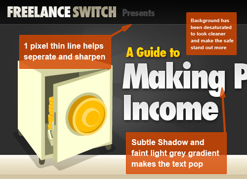
You will hear me say this time and time again, but when you design for the Web it is ALL about the pixels. One of your aims should always be to keep things sharp and clean. This means for example:

  1. Text Clarity
    When laying out text, you should give thought to what Anti-Aliasing you use. To do this you would bring up the Character panel, which you can do by going to Window > Character or when you have the Type Tool selected and some text highlighted, press Ctrl-T (yes it's the same shortcut for transform so you have to make sure the text is selected). In your Character panel, down at the bottom right you can choose between None | Sharp | Crisp | Strong. For different fonts and different sizes you should experiment. I mostly use the setting Sharp which will force some pixels to be aligned and sometimes distorts the font a little at smaller settings. But for example in the image below the text Making is set to sharp, which is why when I apply a 1px outline it is very clearly defined.

  2. Lining
    As you can see between the lighter grey and darker grey bars, I have added a faint 1px line. This trick mimics the effect of the sharpening filter. If you have ever run one of the sharpen filters too often on a photo you will notice that little borders start appearing. This is because emphasizing the border between makes the two parts appear more separate to your eye and hence sharper. So often times I will use a faint line to emphasize the border and make the two parts seem clearer.
  3. Colouring
    Color can also make a big difference in sharpening things up. In this instance, I desaturated the background from a sort of off-grey/green to pure grey. This means that the safe, which has a greenish tone, stands out more from the background and winds up looking sharper.
  4. Cleaning Up Objects
    Another thing that I did not do in this image but that you can do to sharpen things up is to go through objects like the logo or the safe and make sure that edges are pixel aligned. So, for example, have a look at the left edge of the safe compared to the right edge. You will see that the right edge looks slightly blurry. We could fix this by using the Polygonal Lasso Tool (L) and selecting a tiny edge off the right side and hitting Delete. Of course this isn't essential and I don't mean to sound nit-picky, but it's a good idea to think about these details and make sure everything is nice and crisp!

One other element to discuss here is that on the text you will see a faint gradient / stroke effect. This is achieved with two layer styles, an inner stroke of 1px and a subtle gradient. I've used this here because it is part of the FreelanceSwitch brand, and it also is quite a Web 2.0 sort of effect. It is best done with Sharp text as mentioned previously. You can see the exact layer styles in the Sample PSD below.

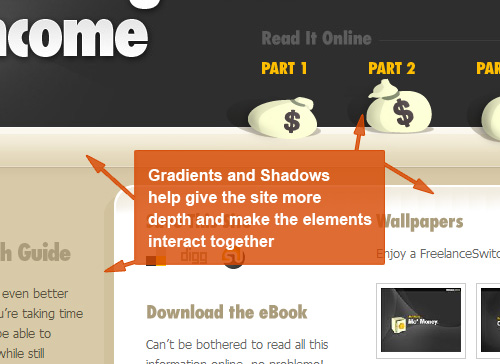
Step 2 - Light and Shade:

Gradients, Gradients, Gradients. Some would say they are the hallmark of Web 2.0 design, and I must admit to using them constantly in my designs. In the image below, you will see that I have added shadows and gradients to a few different places to give the design more depth.

One of the principal differences between print and Web design in my opinion is the amount of depth you need in your design. What I mean by this is that in print design, if you were to have a brochure cover with a straight, flat color, often times it will still look lovely because of the paper stock or a celloglaze that might be applied and the reaction of light to that paper/coating. So in the 'design' it might look like a simple flat color, but in the output it will have depth nonetheless. On the screen you don't have this effect.

This is not to say that you can't have flat backgrounds or panels of color in Web design, however, all the print designers I have ever art-directed to create Websites, the most common two failings I have noticed are

  1. Failing to focus on sharpness and clarity of the design
    In print, you rarely zoom right in to modify individual pixels since when something is printed out, that level of detail will often escape the eye anyhow. You think in millimeters not pixels.
  2. Failing to add depth cues and sufficient visual interest
    Gradients generally don't work that well in print, but on screen they work a treat. Similarly adding faint shadows and highlights work well on screen. Together they can make a site much more visually appealing as the different elements on the screen play against each other. In the image below for example, the money bags, which were initially straight vector images with flat coloring, were given very subtle graduations using the Burn Tool (O) so that they looked softer.

Step 3 - Precedence:

Precedence is the single most important visual aspect of information design. And since Web design is largely about how you lay out and present information to your user, precedence is therefore of the utmost importance.

What do I mean by precedence? Well when you look at page you have to ask yourself, what do I look at first, what's next, what's after that, and so on. And why do you look at certain things in a certain order?

Visual precedence is a mix of factors:
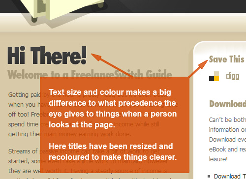
  1. Size
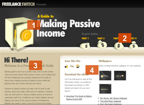
    It's pretty obvious that something big is going to take precedence over something small. So in this design, the safe and the main title have top precedence. When you look at the page the first thing you notice are those two elements.
  2. Colour
    Color also creates precedence. For example in the Before image you will see that the subtitles in the area marked 4 in that image below were initially the same Dark Blue as the words Hi There! This meant that there was less distinction between the two and it was not as clear which was meant to be read first. By fading them back to a beige, they are given less importance and it is more obvious that they are of less importance in the information hierarchy.
  3. Background Color
    With both background color and color in general, the important thing is not so much what specific color something is as what colors everything else is in relation. So for example if everything is black on a page and there is one white object, obviously that white object is going to leap out at you. In this instance by contrasting bright yellow with the dark grey we get emphasis. So although the very first thing on the page that you see might be the safe and the words Making Passive Income, you will probably notice A Guide to next, and the Part 1| Part 2 | ... navigation second. This is on purpose as I want the user to see first a visual image and a title so they know what they are looking at, then I want them to see the primary navigation so that they understand how to get around the site.
  4. Position
    Finally position in the layout also makes a difference in how items are perceived. As you have probably heard, studies show that the user's eye goes from top left to bottom right in some variation (I've seen both studies that say it goes top left to top right and then bottom left to bottom right, and alternately that it goes in a kind of arc from corner to corner.) The important thing here is that having something higher up usually gives more precedence, and having something further left usually gives something more precedence.


Step 4:

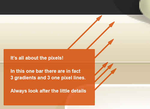
I've said it before, I'll say it again... It's all about the pixels!

In this image, you will see what appears to be a fairly straightforward gradient. In fact there are three gradients drawn in and three 1-pixel lines used. It's quite subtle, and arguably doesn't make that much difference, but in my opinion every detail counts towards the end.

Step 5:

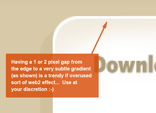
Someone in the comments asked about Web 2.0 sorts of styles. Here is a simple effect where you give a 1- or 2-pixel outline and then a faint gradient for a background. If you hadn't already noticed it already, you'll start to realize it's all over the place, possibly a little overused, but kind of nice anyhow.

Step 6:

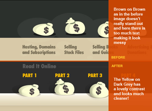
In this image, you can see how sometimes during the polish you may even change the actual information on the page. In this instance, I decided that although it was more infromationally rich having all the titles for the different parts underneath the money bags, it looked so messy I didn't think it was particularly informative - though this is somewhat debatable. So instead I removed the excess brown on brown text and replaced it with bold yellow on dark grey, which because of the contrast leaps out.

And there you have it!

So there is my first Web design tutorial. Please let me know in the comments if this is informative. It's challenging explaining Web design! Also bear in mind that my style of Web design is of course my taste, particularly as I am my own client in 99% of projects I do these days :-)

The next time I have a Web site to design, I am planning on recording the whole thing with a screen capture program then speeding it up into a few minutes. So you can look forward to that! I think it's going to be pretty cool, though I'm a bit nervous because like all designers some days it comes easy, and some days it's a blank slate inside.

Anyhow hope you enjoyed the tutorial. Please give it a Digg if you did!


Sample PSD

One quick note about this PSD, I haven't labeled any of the layers or grouped them. This is quite literally the PSD that I built the site off that I've zipped up for you to look through. The design and contents of the PSD are provided purely for instructional purposes. Copyright for the design and illustrations rests with the respective owners. Please don't use elements of the design elsewhere.


Enjoy this Post?

We'd love your vote!

User Comments

( ADD YOURS )
  1. schoenling128 October 10th

    Thats quite interesting…It really looks better after the redesign…and that with some simple tricks…Thx


  2. Alain October 10th

    Wow!
    Your before and after pictures are dramatically different when factoring in the small details.
    This tutorial is definitely getting bookmarked and referenced when I build my next website.


  3. Jeff Vincent October 10th

    Thanks so much for the tutorial!! I am currently working on a new design for my blog (and moving it to my own space) so these tutorials are so great! I read/practice many of your photoshop sessions so this is a great addition for me! Thanks so much for your help!

    -jv


  4. MICHAEL LAWLESS October 10th

    great tutorial as usual keeps up the great work


  5. Elliott October 10th

    This is an outstanding write up!! You guys are going to win big with this blog! Thanks for putting your time and energy into it!


  6. tuck October 10th

    I enjoyed it as well. Thank you for a clear description. It’s always interesting to see how other designers work out the details. Keep it up!


  7. Froosh October 10th

    Another nice tutorial, great work :)


  8. drumkeyjw October 10th

    Great tutorial. You really don’t see too many tutorials about the “why” of design; most of the tutorials are just about the “how”. It’s nice to know the why…

    Thanks!


  9. Jonker October 10th

    Again I enjoyed a great tutorial on this site. If it wasn’t for the fact that it’s already way to late, I would try and design a website right now with all the new design ideas I read tonight. Thanks.

    MJ


  10. Johan October 10th

    This is a great tuts to all web graphic designers. I like this new and trendy stuff. Keep em coming !


  11. manamex October 10th

    Great tutorial, thanks!


  12. Ahmed Al-Shamsey October 10th

    Graet Work, you’ve been helpful and this one is even more helpful to me


  13. Stephen October 10th

    As this is a Photoshop oriented sight, I already know the answer to this question, but I took one look at the layout and said “This has to have been done in Illustrator”. Remarkable.

    Great article, and it helps give a bit of insight into your design process. As elementary as it is, approaching it from a two phase process could help ease the “This has to be perfect from the moment I create the canvas” frustration.

    Kudos as well for your decision to host your bigger stuff on Amazon S3. No “Digg Effect” worries here.


  14. Collis October 10th

    Thanks guys! I’m glad everyone enjoyed this. I was actually a little nervous for some reason putting this tutorial up. I think it’s because it’s a bit different to the rest on the site…

    @Stephen: Yeah I find it’s always best to break up the design process a little. Usually also I find by breaking it up you find it easier to see what needs to be done when you come back. Sometimes if you sit staring at the same piece all day you stop being able to see how to improve it. But taking a break and coming back later means you have fresh eyes (and usually they are much more critical :-) )


  15. mediamelt October 10th

    As somebody who designs websites for a living at a full-time 40+hr a week job I must say excellent job on the tut. That much expected output per week makes it hard for me to keep things fresh without getting frustrated with my final results. Your methods will keep me going a little longer and help me work smarter! Here’s to work to be proud of! You rule!


  16. Marten October 10th

    Great tutorial!
    Really shows the importance of small details in design.


  17. Backfire October 10th

    I enjoyed this tut a lot. I learnt more stuff about creating websites! :shock:

    Never knew all those little details made such a huge difference…


  18. bintek October 10th

    great tutorial! i learned a lot from you today. thanks for sharing your knowledge.


  19. Joefrey Mahusay October 10th

    I’ve learned a lot of things here. This is a Great Tutorials! Thanks!:)


  20. Robin Rath October 10th

    This is a great article, thank you for sharing this information.


  21. feanne October 10th

    Good job! :) Thanks for sharing your knowledge with us.


  22. panther October 10th

    That was an amazing tutorial. Kudos for your hard work on attention to detail.


  23. katan-ko October 10th

    Hi I am Katan-ko and am very impressed with your webpage and content. I am sort of reluctant to post on the web.
    This was an absolutely amazing informative and interesting work . I hope to establish a more refined version of my consumer oriented editorials which can link with the actual documentation collected by consumers.Presently my first
    forays are on Associated Content. Would any of you care to
    read the information. It needs polishing, but I am paid per view
    (somehow that sounds strange) If I have enough viewers I can pay pal a web designer. Any friends out there?
    Katan-ko


  24. nimbus October 10th

    You = da man


  25. Boulderdash October 10th

    A most excellent article.


  26. Max Zuckerman October 10th

    I am a huge fan of the fine details and clean looking designs. I actually read this start to finish and found myself really learning some interesting techniques so I just want to say thank you.


  27. JoK October 10th

    Thanks a lot, very interesting article.

    indeed, I didnt knew the details with pixels etc.

    I’ll watch it know ;)

    Keep on going !


  28. Neil October 10th

    Great site and great tutorial! The site looks really good… One thing though, as well as looking good the site should be coded correctly as well. Neither the Xhtml or Css validate which can often be the root cause of rendering problems across multiple browsers.


  29. George Huff October 10th

    This was really well done - freelanceswitch.com was the site my former employer raised ethical concerns over!! Monitoring my traffic only pushed me off the ledge.

    Keep up ALL of the good work.

    Cheers.


  30. Paul G October 10th

    How was the coffee?


  31. Kayzah October 10th

    Very nice tutorial.
    Thumbs up! ^^


  32. Sultan October 10th

    Hi!

    It was very usefull, and good to read as well. Maybe a few words on the overall scaleing of a layout, or the grid systems you use mostly would be nice next time. :)

    Thanks again!


  33. RobotDerek October 10th

    What does Poland have to do with web design? This article is about The Polish right?


  34. Chuck Vosburgh October 10th

    Well done! You’re obviously an expert designer!


  35. Eric October 10th

    Definitely very informative! I’ll be looking for the next part!


  36. badass October 10th

    sorry to be a nasty guy, but i don’t see a lot of improvement. Sure it looks a bit brighter, and the title really needed a bigger type, but basically all you do is add Web2.0 effects all over it. which is a bad thing.

    I love your site though :) i would really like to see a complete redesign of some website, step by step.

    goodluck!


  37. Brian October 11th

    Really nice tutorial!

    Could any of you guys tell me what font is used for the example here?

    /b


  38. WebTuga October 11th

    Your tutorials are the best!
    :P


  39. Brett October 11th

    Your site is not valid HTML… start there.


  40. Chad October 11th

    Good post - thanks.


  41. Josh Banka October 11th

    You forgot the following points, all of which this page violate:

    - resizeable tables/div layers to benefit both wide and narrow monitors (the side bar is cropped out in narrow screens)

    - letting the user know what is and is not a link by consistent coloring/underlining

    - avoid debranding familiar tools like dig this and delicious so the user can immediately identify the tool


  42. Percept October 11th

    This is fast becoming my favorite tutorial site … fantastic work with great walk-throughs. Thanks!


  43. Erik October 11th

    It’s all in the details :) Thats what i call pixel-perfection!
    Great to see a tut that doesn’t just focus on “flashy” design but gives a better understanding for the design and feel aswell.

    Great TUT!


  44. Shawn October 11th

    Another Brilliant Tutorial! Great work Collis!


  45. mygrads October 11th

    hey Collis, your gradients look smooth, but in mine I can see ‘borders’ where the color shifts. any tips?


  46. Crunk October 11th

    Great tutorial, but why is this site so hard to read? The type is bearly visible.


  47. Trebor October 11th

    Yes! Now I can finally copy Freelanceswitch, the world is mine!!!! muahahahah


  48. Holly October 11th

    Elements of Great Web Design:
    1. Light brown font on dark brown / black background is not it.


  49. AirDig October 11th

    Great work! And thanks for sharing the photoshop file - this is really helpful.

    You should start a polish service! (except people would get confused by the double entendre).


  50. Simon Tullstedt October 11th

    Wow, this was great, thx a lot! Once again it’s proved that I really have to give up my romance with Illustrator, and I will…

    …someday.


  51. Bedrich October 11th

    Thanks a lot for this and all your other tutorials.


  52. CVOS man October 11th

    Excellent summary and good description of conversion elements, however it is still difficult to read text on a black background, no matter what color or font you use.


  53. Robert October 11th

    This is a really great tutorial and i liked it a lot! Thank you for writing!


  54. Mark Nutter October 11th

    Excellent tutorial, this is exactly what I needed. I re-designed nuttersmark.com for the umpteenth time recently and chose to focus first on type, layout, and coding first before adding the polish, and after reading this tutorial I went and added some of the elements you talk about. There’s a lot more work to be done but it’s coming along nicely. Thanks!


  55. Julia October 11th

    I’m a package designer and not a web designer, but these are excellent points for any kind of design. Thank you for all of the great inspiration and tips! I have always thought that the one thing people usually forget or put last in design is the typography, and look! Here it is! Subtle things to make everything pop and work together. You are marvelous…hope you are getting paid what you’re worth buddy :)


  56. VodkanLemons October 11th

    This page has a hot background color.

    When you look at it with an LCD screen, the top is darker than the bottom. It’s cool how it fades.

    What color is this?

    email

    a p e l i o 1 at a site called hot mail dot com


  57. Photoshop Tutorials October 11th

    A design can be so awesome with such small tweaks, awesome tutorial.


  58. Jay October 11th

    Interesting, informative and helpful, especially for newbie designers like me.


  59. Alex Scott October 11th

    Brilliant tutorial, I’ve been forgetting about the little details too much recently, thankyou so much for putting this right.

    Much appreciated,
    Alex.


  60. Alex October 11th

    Good write up, that clears a lot of things up on how to achieve those effects. I definitely am looking forward to your recording of the next design


  61. Andrea October 11th

    Great tutorial can’t waito to see more, if only your site text had more contrast…


  62. violette October 11th

    hey! i really liked this article! i’ve been reading some of your posts lately and i truly enjoyed them. they are pretty professional and well explained. congrats :)


  63. Rachelle October 11th

    Thanks for the tutorial.. very interesting!

    I noticed that none of the Eden Creative sites use photography. I’m wondering if you have any advice on incorporating photography into sites of this ’style’?


  64. Mr_LeE October 12th

    great job mate… read the whole thing as soon as i saw the title :)


  65. handx October 12th

    Wow..great..May i know what fonts u using?


  66. Website Design October 12th

    Great advice. It’s the little things that can really make a difference! Also thanks for providing a working example. There’s tons of blogs everywhere with advice and pointers but without and example it can be really difficult for some to visualize. So thanks.


  67. Andrew October 12th

    Amazing tutorial, I would like to see more like this one.


  68. joel October 12th

    this was highly informative. The extra edge of detail you explained is precisely what makes a design look professional. Now I know what I’m goin for. I look forward to more of these!


  69. Milena October 12th

    Can’t wait for the video tutorial!


  70. Collis October 12th

    Thanks guys!

    @Rachel, I’ll be perfectly honest and say it’s largely because I’m not that great with photography :-) I used to have to use photos a lot more when I did client work, but now that I get to do whatever I please, I’ve pretty much stopped using any and become very illustrative. Still I’ll give some thought and see if I can rustle up a tutorial on it, though certainly I’m no expert!


  71. Dan Egan October 13th

    What a brilliant article. We need more like these! BTW - definitely my new favourite tutorial site. Keep at it!


  72. trendsettr October 13th

    For some reason I can’t get your rss feed to work in News Gator. I don’t know if it’s your feed or just News Gator, but I thought I’d let you know. Maybe other people have the same problem?


  73. Shawn Bayer October 14th

    Been a fan ever since I first saw you on digg, and yet again another great tut. Good Work!


  74. Neil October 15th

    post a tut on “template 2 website” …

    ie from creating a template 2 slicing and make into a HTML template …..


  75. Marty October 16th

    This is a wonderful tutorial. Very insightful! Thanks so much. I love the site. Keep up the good work.


  76. Lyndsey October 16th

    Another ace tutorial - to the point and perfect!


  77. cre8ive pixel October 16th

    great tut!


  78. Cfaile October 19th

    Great tutorial. I have just started web design and this helps a lot. I designed my site in photoshop and then put it in Dreamweaver, but I don’t think I did it the best way. Any ideas on going from PS to an actual site? Thought you might know where to point me.


  79. Mud Puppy October 19th

    Great work.

    These tips will definitely be implemented into my next web design!

    mp


  80. Timothy Diokno October 19th

    I noticed that in most Eden.cc sites I’ve been to actually. I’ve also been waiting for this post for a long time and now it’s here and it’s time to thank you and say… YOU ROCK!


  81. killeredge October 22nd

    nice job! but just so you guys know, this wasn’t a redesign, but a realign. he did not change the whole layout and colors, but modified it so that it stands out more.

    and by the way, nice paypal button. care making a tut on how to make buttons like those?


  82. Samer Hamadeh October 22nd

    Thanks for this Great Toturial.
    In fact, it changed my view and helped me design cool sites.
    Can’t wait for the video tot.


  83. Josh Grauer October 30th

    Excellent article!

    I don’t do a lot of design work, but over the last couple years I’ve had the opportunity to work on a few projects and I slowly started to notice the details you mentioned in the article (1 pixel borders, subtle gradients, etc). These are the kind of things that make a good design great and I’m really glad that you took the time to explain them.


  84. Britney November 8th

    I LOVED THIS! As a web/print designer, I find it hard to switch back and forth between the two media’s. Can you write a book about web design, because it’s hard to find one!


  85. stfalx November 8th

    I am a web developer and from all the web tuts i brows over the internet. This is one of the best if not the best. I saw so called “noob designers” on other websites speaking about a crappy tut that is remarcable and stuff like that. But this one here is trully wonderfull. You should get into webdesign more seriously, start making a name for yourself, and make tons of cash man. Respect for you.


  86. taha November 13th

    thank you examplate website…


  87. zooley November 14th

    Awesome article, probably the best i ever read. Thanx for sharing it.


  88. Edwin Khodabakchian November 14th

    Hi,
    I am new to this site. This tutorial is great! How do I contact the author about a potential project?
    Thank you!
    Edwin


  89. Osvaldo Osorio November 17th

    Excelente Tuturial. Thanks to share with us your great experience and aweson tips!

    It’s Rocks!


  90. Paz November 19th

    It was quite interesting. Now I realize how attentive one should be when it comes to details (like pixel matters), well said.

    In future, i hope to see more articles on usabity and information architecture.

    Thank you


  91. Muhammed shaheel November 21st

    Well said.. I was expecting this kind of tutorial these days that lets to understand the concepts in a methodical way..Welldone. Will you pop up a mail to gameshah@gmail.com if you write more tuts or video tuts(as you said) to me ?……if so that would be great


  92. Pieter-Jan November 23rd

    This is one of the greatest tutorials I have ever read. I would have never come up with these kinds of things but after reading your tutorial and practicing a bit I just have to say it looks MUCH, MUCH better! Thanks.


  93. Herb November 25th

    Brilliant, just brilliant. I’ve been staring at thousands of ‘inspiration’ sites etc etc but finally someone not giving step by step, but EXPLAINING why and how!

    Thankyou! I was glued!

    More!


  94. Alex November 29th

    Very nice, much appreciated!


  95. shylendhar November 30th

    its excellent.. and really helpful to designers.


  96. shipshaq December 4th

    i cant believe this site, it is wonderful examples for my sites.


  97. kofty December 10th

    Thanks for the tutorial.. very interesting!

    I noticed that none of the Eden Creative sites use photography. I’m wondering if you have any advice on incorporating photography into sites of this ’style’?


  98. Michael December 17th

    This page is entirely too long from comments, you should consider adding comment pages.


  99. Jayant December 17th

    Very interesting but as others are saying, a bit long.
    Thanks. - Jayant.


  100. Jason December 21st

    You refer to it as Precedence but I would refer to it as Hierarchy. Pretty much the same thing its just that in my designing years i’ve seen the word Hierarchy mentioned a lot more. All in all though this has some useful tips and lots of good guidance for people who are looking at how to go about designing a website.
    Nice work.


  101. Eric M January 9th

    That was probably one of the best tutorials I’ve ever read. Seemed like a college-course required reading in terms of quality!


  102. Brian January 15th

    Wow, what an outstanding tutorial! This is the sort of information I’ve been looking for for a couple years now. My designs always turn out a bit “flat”, and now I can finally begin to see why. I hope there will be more tutorials like this in the future.


  103. Thomas J January 17th

    What a great article. I really feel that this helped regain some of my focus in being a great designer. I have been lead astray in recent years by super technology and web trends, but what it should really come down do is does your page appeal to the general audience. Thank you so much for giving back to the design community!


  104. AJ January 31st

    Fabulous! Not too long at all and very well written. The visuals are lovely and the improvement in the example site is amazing. Sigh - I need to go redesign my site now!


  105. Roger Omlid February 29th

    Great Tutorial. I need to use some of this information on my new sites.
    Thanks and Good Luck.


  106. Simon James March 1st

    Wow what a difference that makes. I will be defiantly including these techniques in my new website designs. Great tutorial. Thank you.


  107. Pixy web March 11th

    Amazing article, I really loved it. It is a great tutorial for web designers and the result after redesigning is great!


  108. Hamed March 20th

    Great Tips here Collise


  109. Evan Meagher March 24th

    Great article! I look forward to the video of your design process.


  110. Andrew D March 25th

    This is by far the best tutorial on the site!


  111. Satheesh March 26th

    Another Great tutorial.. keep it up :)


  112. Brian Cleveland March 30th

    Thanks