Making a Print-Ready Business Card Using Only Photoshop
In Designing by CollisCalling Card Competition
Over at our sister site FreelanceSwitch, there is a competition to make business cards using vectors from a special Arsenal sample pack. So if you'd like to Win $370 worth of vector gear, head over and put in your entry! I actually had to make an example card for the write-up, and while making it, decided to write a tutorial for what I was doing (which is what you are about to read :-) )
Step 1
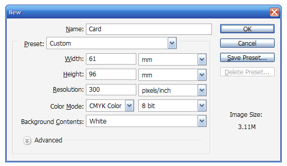
Ok, so the very first thing we need to do is create a New Document. Depending on where you are planning on getting your cards printed, you may need different dimensions. The printer I use here in Sydney has a default card size of 90mm x 55mm.
When sending things off to printers however, you need to add a sort of border around the image called a Bleed. A bleed is basically the space on the edges of your design where the image keeps going past where the printer is going to cut the paper. That way if the cut lands a mm to either side you don't wind up with blank paper at the edges. How much space you leave for bleed also depends on your printer. Generally speaking 3mm - 5mm is a good amount of bleed.
Because of a quirk of Photoshop (which you'll see later) we're going to use a value of 3mm. So when creating the image, instead of making it 90mm high we are making it 90mm + 3mm bleed on the left + 3mm bleed on the right = 96mm. Similarly with the width, we're making it 55+3+3 = 61mm.
Note also that because we are making something for print you should set the Resolution to 300dpi and Color Mode should be set to CMYK. We'll talk more about the color mode later, but with the resolution you should note that 300dpi basically means there is more image information available so you get a sharp print out.
If you ever have to make a huge poster, you can sometimes get away with as little as 120dpi, but it really depends how far away the person will be looking at your work from. If you are printing 120dpi, the quality up close will be pretty bad. If it's a giant poster (think meters rather than centimeters), then you can get away with it. Anyhow because this is a business card, we should make it 300dpi so it's a nice, high-quality print.

Step 2
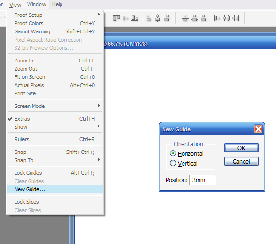
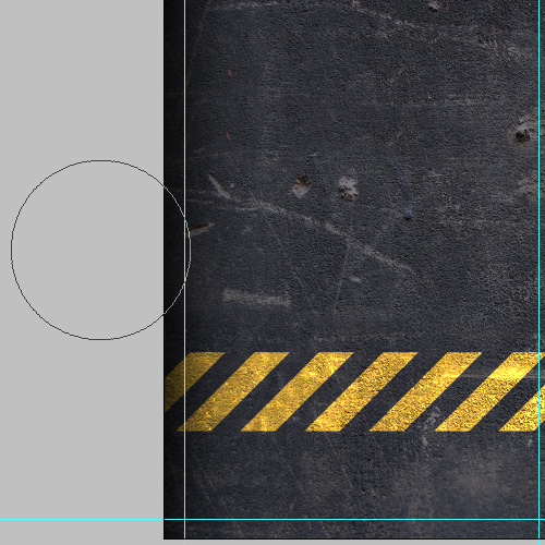
Once the document is created, the first thing we need to add are some guides to show us where the edges of the business card are and where the bleed starts. So first of all press Ctrl-R to switch on your rulers. Now to add the guides, you can either click on the ruler and drag guides out on to the document, or for a more precise method, go to View > New Guide and then give it a Horizontal position of 3mm. Repeat again with a Vertical position of 3mm. Then repeat twice more with Vertical / 58mm and Horizontal / 93mm.

Step 3
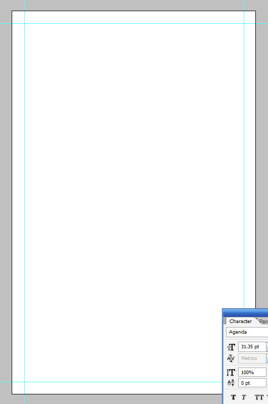
You should now have a blank canvas similar to the one below with four guides, each 3mm away from the edge.

Step 4
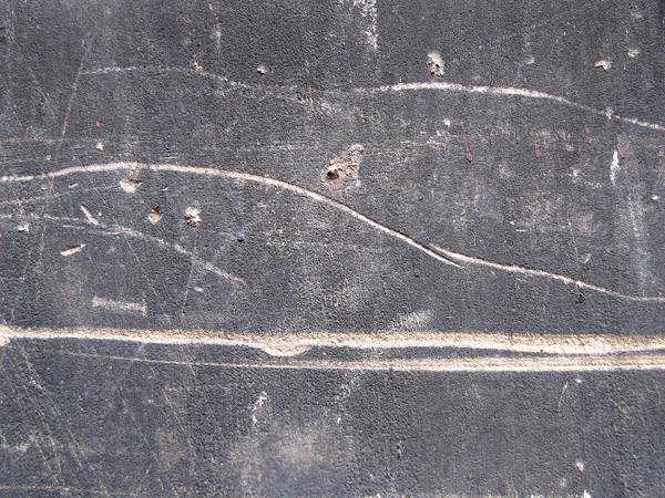
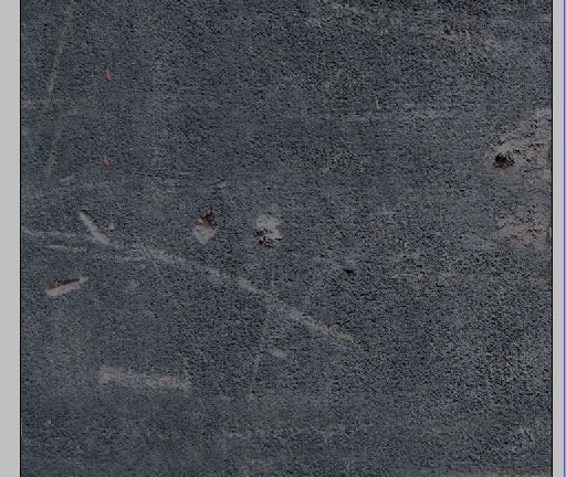
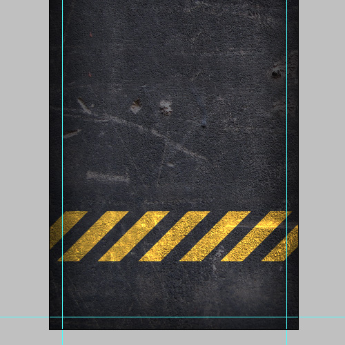
Now because I made this card for the FreelanceSwitch Card Competition I had to use an element from Arsenal's freebie pack of vectors and textures. I chose this nice texture of concrete because it looks nice and urban! You can download the texture yourself by visiting Arsenal's site and clicking on the Free section.

Step 5
So after pasting the texture in, I hit Ctrl-T to transform it to roughly the right size. Now while I want the texture to be dirty and grungy, right now it's a bit TOO dirty and noisy. So first of all we'll get rid of the two gigantic lines running along from left to right. We can do this with the Clone Stamp (S) Tool. I discussed this tool the other day in the magazine tutorial, but just to refresh, you press Alt to select the area you want to clone (in this case I just used the area directly above) and then brush the area you want to clone over.
Using a soft brush on a texture like this concrete means it's quite hard to detect if you're not directly looking for evidence of cloning.

Step 6
So now we have it looking still rough and urban, but not quite so rough.
At this point I decided that I wanted to darken the texture, so I added a layer above filled with the color #797c82 and set it to Multiply. However, the look was a bit strange and has a sort of bluish cast (see below) whereas I want it darker and greyer. This is to do with the color mode we're in - CMYK. So time to talk a little bit about color modes... (at least as I understand them)
Basically CMYK are the four process colors that most printers print with. Using these four colors (Cyan, Magenta, Yellow and Black/Key) you can make most other colors. You can, in fact, get special inks like Pantones as well which we'll discuss in a future tutorial, but for most things it's just straight CMYK.
Now on your screen, however, you use RGB which as you know stands for Red, Green, and Blue. The difference comes because on a screen you are looking at light mixing, so if you add all the colors together you get white - that's why in RGB the color code for white is R:255, G:255, B:255 - i.e. full red, full green, full blue.
On paper, on the other hand, you are seeing the result of light interacting with an object. From my hazy recollection of high school science class when light shines on an object - say a red wall - the object in fact absorbs the light and reflects back the ones it cannot absorb, so the red wall reflects the red, but effectively eats up the rest, giving it the appearance of being red. So basically on paper it's the *opposite* of on-screen where it's projected light. On paper having full Cyan, full Magenta, full Yellow and full Key in fact produces black because it absorbs all the light (which is the reverse of RGB where it produces white).
Now all of that was just some useful information explaining why there are different color spaces. The key thing to note is that the range of colors you can make with CMYK is smaller than what you can make with RGB. So when you switch to CMYK, you will find that some things don't work as well - things like Overlays, or getting super bright colors to show. Once you actually print out, often they will still look nice enough, but sometimes to do the things you may have gotten used to in Photoshop, you have to switch between color modes. Remember though that if you switch to RGB, you should switch back to CMYK before you send it off to print. To preserve the effects, we will flatten everything down at that point (you'll see what I mean later).
Switching Color Modes
Ok, hope you're still with me--basically what happened at this step is that I decided I needed to switch back to RGB to get the right darkening grey, and more importantly in the next step when I want to put yellow blocks overlayed, I also will need to be in RGB.
So you can do this by going to Image > Mode > RGB Color. It will ask you if you want to flatten the image--say no! You should see an immediate shift in the coloring of the darkening effect.
And, yes, I could have made this step a lot shorter and just told you to go to RGB, but it's useful to learn about color spaces :-)

Step 7
So here we are in RGB mode. Next we want to draw some diagonal blocks. So grab the Polygonal Lasso Tool (L) and then create a new layer.
Now you want to draw the shape shown below. To do this nicely, you should hold down Shift so that it forces the angles to be multiples of 45' and give you a nice even shape.

Step 8
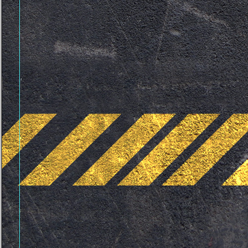
Once you have the shape, fill it with Color: #c4b10f, which is an ugly yellow color, and then set the blending mode to Color Dodge. Now you should have a bright yellow that looks like the one below. Note that if you switch back to CMYK, you will see how this effect doesn't work at all and why we had to switch to RGB earlier.
Anyhow duplicate this layer a few times until you have six yellow bars and just roughly space them out so that one is right on the left and another right on the right with the rest clumped in between (we'll space them accurately in the next step).
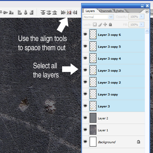
Step 9
Now rather than trying to space by eye or by pressing the arrow key the same number of times (which I'm embarrassed to say I often do), we will use the align tools. So first hold down Shift and select all the layers with yellow bars in them. Then up the top click the Align Tool marked below. This will automatically space them accurately!
(Note that I think in Photoshop versions earlier than CS2, you need to link the layers with those little paper clips because Shift-Selecting layers only appeared in CS2 - the version I use. CS3 users I expect are similar to CS2.)

Step 10
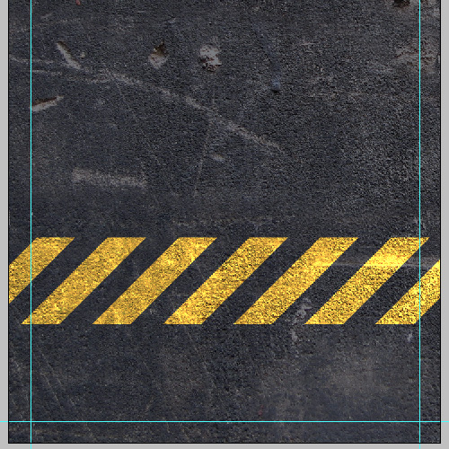
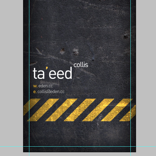
OK, now we have a nicely spaced-out little marking that looks sort of industrial!

Step 11
Next I created a new layer above and with a large soft black brush gently brushed along the edges. Remember, that anything outside the guides will probably not make it into the final card (unless the printer misses their cut), so the black should extend just over the line if it's to be visible in the final product.

Step 12
So just to discuss bleed again, as I mentioned earlier everything outside those guides is just extra material for the printer to cut away. So it's important at no point to put important things like text anywhere near the edges unless you don't mind it potentially being cut. In my experience most printers in practice don't stray very far from the cut line, however it CAN happen, especially if you use a cheap printer.

Step 13
One problem doing this stuff in Photoshop is that there is no way to automatically hide the bleed area, which means sometimes when looking at the design it doesn't quite look right. In InDesign you can switch to a special preview mode that hides the bleed, but in Photoshop we have to do this manually. So often I will create a layer above all the others and fill the bleed areas with white. Then I can switch this layer on or off so that i can see a little more accurately the proportions and area that will actually make it to the final printed item. Just make sure you switch these off before sending to the printer!

Step 14
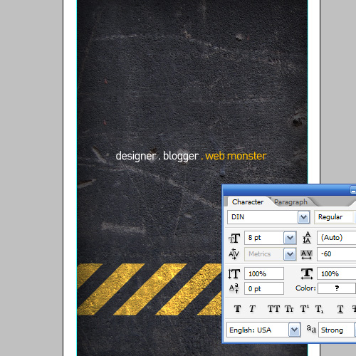
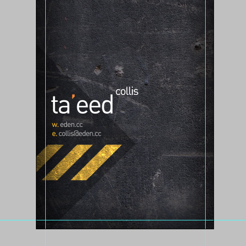
Next I placed some nice text on the card. This is actually the back side of the card (we'll do the front in a second). I used an uber cool font called DIN which is very minimal and as you'll see in a second has an awesome '@' character.
I've set the type to be 8pt. If I remember correctly you should never go less than 6pt if you want something to be readable, and if you want it to be easily readable 7.5pt and above is best. As with all these things it depends on who your audience is. When making business cards for I would go with something that a person can quickly read at a glance when flicking through their pile of cards. When making something for myself, I often use small type because I can get away with it!
I also set the type to blending mode Linear Light so that it interacts a little with the background. Once this is done, we can save this document as Back.psd then go to File > Save As and this time save it as Front.psd, essentially duplicating the file to make the front.

Step 15
Once again for the front I've added a bit of text with my Web address and Email address and name. And for those type lovers amongst you, have a look at the '@' character--isn't it neat! DIN is an industrial typeface originating in Germany which you can read about on Wikipedia.
Typography - or the art of using type/text in your designs - is one of those super important parts of design. If you come from a nondesign education background as I did, then it's very important to go read up about it, because it's the easiest way to pick a good designer from a bad. I'm not the best typographer around, but John Boardley is, and he runs one of my favorite blogs - iLoveTypography. If you want to get into type, go read his blog, it is the bomb!

Step 16
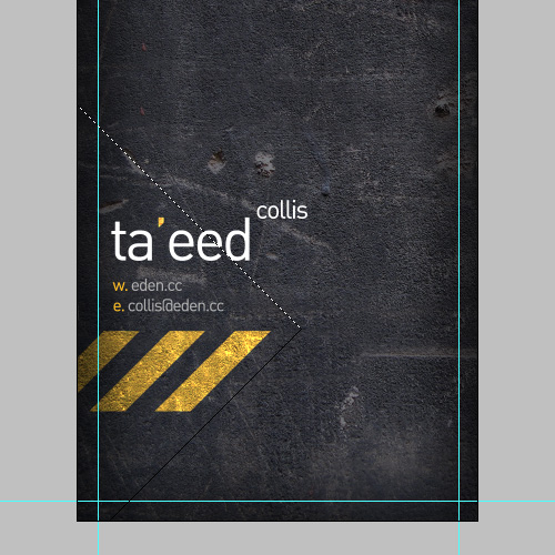
Now the next thing we want to do is to switch off some of those layers that have the yellow bars, so there are just three left over. I want it to sort of look like the yellow bars start on the front and continue around to the back.
Next using the Polygonal Lasso Tool (L), draw out a triangular shape as shown.
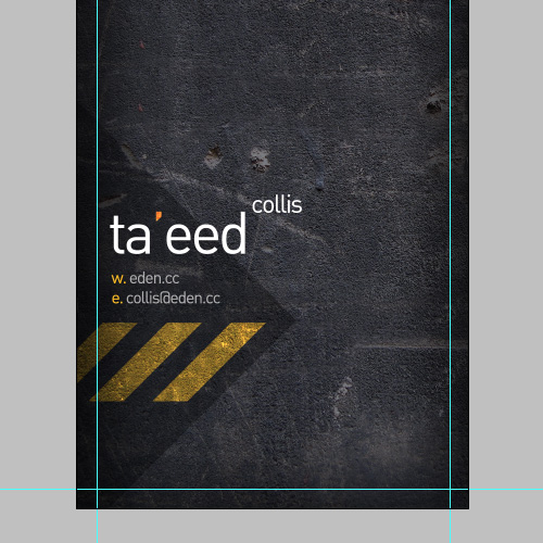
Step 17
Then create a new layer just above the concrete texture and fill it with a dark grey and set the blending mode to Multiply. Now unfortunately that makes the yellow bits look dull, so we'll fix that next!
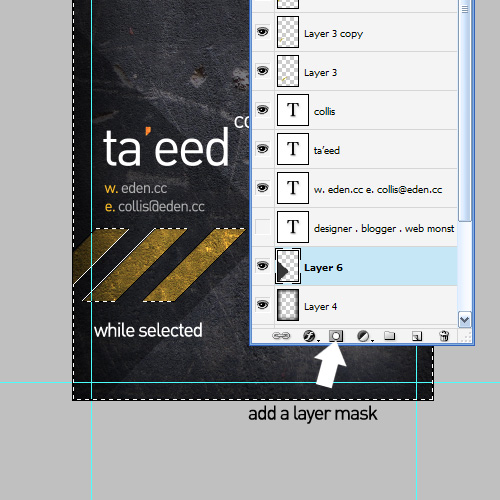
Step 18
So Ctrl-click the first of the yellow bar layers, then holding Shift down, click on the next one, then the next, so that you have the pixels selected for all three. Then press Ctrl+Shift+I to invert the selection as shown. While that's selected, click on the triangle layer and click the Add a Layer Mask icon on your layers palette. This will mask out the areas of the yellow bars so that they shine through.

Step 19
And there we have it! All done...
Now we need to go to Layer > Flatten Image and then to Image > Mode > CMYK to switch back to CMYK and get ready for print. Note how because we flattened the image we preserve the way the yellow was interacting with the road behind it even though we're back in CMYK. So basically we've taken advantage of RGB to achieve an effect and then flattened it down and switched back to CMYK so that we can print.

Step 20
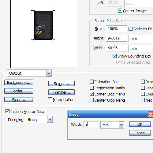
Now go to File > Print with Preview and you should see something like shown below. If you don't have all the options, click on More Options and they will appear. Check the box which says Corner Crop Marks, then click on the button that says Bleed and set it to 3mm. Note that for some reason Photoshop doesn't let you go much higher than 3mm for bleed. I don't really know why they've put an artificial cap on it, but maybe there is some amazing reason that I don't understand.
Anyhow one thing you should do (that I just realized I didn't do in the screenshot) is to untick Show Bounding Box.
Once you're all done, you should be able to print to a PDF, do the same for the back, and deliver that to your printer. Note that to print to PDF, you need to have a copy of Acrobat installed (not just the free Acrobat Reader, but the full version). If you have this, then you're all finished now!
If you don't have Acrobat, never fear... all is not lost!

Step 21
If you don't have Acrobat, then forget the Print with Preview way of doing this and instead, go back to your document, create a new layer at the top, then using the Single Column Marquee Tool make selections around your guides as shown.

Step 22
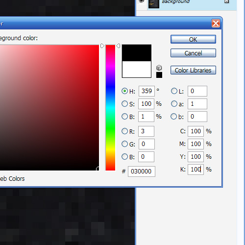
Now we are going to draw in our very own crop marks. To do this we need to make sure we use what is called Registration Black. Registration black is basically 100% of all the CMYK colors (as shown). There is a bit more to it than that, and you can read more on Wikipedia if you are interested.
Anyhow so select the right color and then fill in those selections from the previous step. Then using the Rectangular Marquee Tool, cut away the lines so that there are just small single lines in each of the four corners left - i.e. four pairs of crop marks. Then go to Save As and save your file as a PDF using Photoshop. This should be OK for a printer, though to be honest I've never actually tried sending a file with crop marks like this to a printer, so it's probably best to ask them if it's OK before you go printing zillions of cards :-)

Step 23
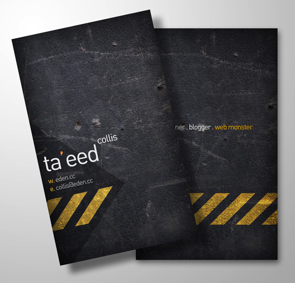
Anyhow so there're my simple little business cards. They look kinda neat and should be ready to print. In the sample files you'll find both the back and front as well as the PSD file I used to render this little image below which is my quick attempt at faking the printed cards.
Don't forget that over at FreelanceSwitch, there is the competition to make business cards using vectors from a special Arsenal sample pack. So if you'd like to Win $370 worth of vector gear, head over and put in your entry. You won't need to do all the print-ready bits, so it's nice and easy to enter.


Brenton Keller
October 24th, 2007
Awesome tutorial
Kris
October 24th, 2007
Holy crap man. That is a nice calling card. Your not entering the contest are you? That would seriously blow for the rest of us!
Great Tut btw.
Bedrich Rios
October 24th, 2007
Great tutorial.
Jeffrey
October 24th, 2007
great tutorial, this one got me up on my feet
jizi
October 24th, 2007
simple but effective style
Joefrey Mahusay
October 24th, 2007
Wow! Nice tutorial…
nitesh
October 24th, 2007
deserve a standing applause
Collis
October 24th, 2007
Thanks guys!! Never had standing applause before
@Kris: Sadly no it won’t be in the competition, much as I would like to get my hands on all those vector goodies. Maybe I can beg some from Arsenal, or maybe I should just stop being such a cheapskate and go buy them instead of always using the freebie stuff
gura
October 24th, 2007
oops good job thx guys..^_^
Mark
October 24th, 2007
Great tutorial. Simple yet creative. good job
GeminiArt
October 24th, 2007
Thanks Guys, great and simple tutorial … great result
Andy
October 24th, 2007
Great as usual!
Alex
October 24th, 2007
On Windows machines you can install FreePDF XP from http://www.freepdfxp.de/fpx732.htm so you don’t need Acrobat for printing to a PDF.
Ufuk Ömür
October 24th, 2007
Thats great !
Tommy P
October 24th, 2007
Nice one cheers
Artis
October 24th, 2007
This was great. I even forgot, that I’m at work. It was pleasure to read this tutorial. Thanks Collis for inspiration!
Andrew Fleming
October 24th, 2007
First, great tutorial
Normally I don’t use any textures in my designs, usually just nice and clean, blah blah blah. But this has inspired me to at least experiment. I’m a fairly new designer, so I’m wanting to expand my horizons more and more!
Second, I’m still amazed that we use different measurements for everything (inches and millimeters). But you still use dpi… why not dpm?
Peace!
Hobby
October 24th, 2007
This is one of the coolest cards I’ve seen. Great site and great guide!
Dane R
October 24th, 2007
Dude It brilliant, thanks! I really needed to know some of that stuff about colours and bleed marks for future cards I make, shot!
skariddim
October 24th, 2007
great design
johno
October 24th, 2007
What a wonderful tutorial. Probably one of the best PS tu’s I’ve ever read. In addition to that, the actual sample and the finighes article are really great.
Brilliant work.
emil
October 25th, 2007
that was a great tutorial. the card looks great and the tutorial is awesome. It is one that I will probably look over again and again. you rock man! thanks so much for this great tutorial. i hope to see more like this in the future.
Bull3t
October 25th, 2007
Ouch! That is brilliant. Love it! I will have to make one of my own, even though I don’t need one, haha. Thanks for another amazing tutorial!
Chris Guevara
October 25th, 2007
Generally, I am the type to read and read and never comment. This tutorial was fantastic though. Thanks!
Ravi Vora
October 25th, 2007
I definitely could use this since I hate having to play between PS and Illustrator.
Mr_LeE
October 25th, 2007
man.. i love your design sense.. its perfect for exactly what i want
Erik
October 25th, 2007
Super tut! Nice work! Keep em´ comming
Hamish M
October 25th, 2007
Great job Collis. Love the clean typography. DIN is a beautiful typeface.
And I have to agree, iLT is a fantastic typography resource. John knows his stuff.
killeredge
October 25th, 2007
DUDE THAT IS SWEET! >.
TyCat
October 25th, 2007
Wow. very nice tut. got me thinking about what i need to do.
killeredge
October 25th, 2007
DUDE THAT IS SWEET!
I have a AWESOME IDEA for one of the websites im creating and i need help. can u put a tut on how to make realistic wheels
—spoiler of my idea without giving it away
———can u have a tut on making bulldozer wheels?
Colin
October 25th, 2007
i never comment, why? i can’t tell you but this one has stood out for some reason! i love it!
not to mention everything else!
Tapan
October 25th, 2007
Amazing tutorials…mann..simply superb..now this is what i’m really seeking for..this is the 100% use of photoshop
Muzz
October 25th, 2007
Ideally if you are going to print pure black, I would suggest 100K and not a mix. This prevents colour mis-registration as you sometimes see with newspapers.
100K > Mixed CMYK black
Soumya
October 25th, 2007
You’ve got a very unique style! Love your work! Elegant! Outstanding! Thanks a lot!
Gav
October 25th, 2007
The only thing with this is your type wouldn’t come out great.
Obviously Photoshop being a paint program, everything made of pixels etc. it blends the edges of the type into the background, whereas Indesign/Quark/Illustrator etc. don’t.
Unless you’re sticking an effect on your type (which Illustrator/Indesign can do to some extent anyway) — always do your type in a program other than Photoshop.
g. eren
October 26th, 2007
Background is nice.. really good tut. thank you..
Richo :D
October 26th, 2007
You guys continue to amaze me. This is my favourite Photoshop website by far!
There is so much junk out there - especially in tutorials. I am so lucky I stumbled across psdtuts.com, you guys have changed the way I use Photoshop!
Thanks x1000!
Keep up the amazing work!
Regards,
Richo
ntslide
October 26th, 2007
All of your tutorials are such a pleasure to read. Always thorough and professional and complete. Thank you so much!
Eric
October 26th, 2007
pdf995 at pdf995.com is another great printer driver. This is what I use, because I’m a cheapskate too!
But seriously, it does a good job (and it’s free!).
Marty
October 26th, 2007
This was a great tutorial. I always enjoy your small tips that I wouldn’t have thought of. The info on color profiles is great too. I may just be speaking for myself, but I always knew the color rules, without knowing the reasons.
I really enjoyed this tutorial. Thanks.
leandro
October 26th, 2007
Very good !
Guido
October 26th, 2007
I am already creating my entry for this contest. Great tutorial by the way! - I hope to see more of your work soon.
Chris
October 26th, 2007
Hi, can’t find anywhere the font DIN, do you have a source where to get it? Thanks. Chris
Headshot
October 27th, 2007
Great Tutorial! Awesome Result!!
Zerimar Group
October 27th, 2007
This has got to be one of the greatest tutorials on making a calling card that I have seen. Thanks for posting this and encouraging great design.
Cheers!
Arthur
October 27th, 2007
The results look great on screen, but that small type coming out of photoshop will look pretty bad in print. Do not use photoshop for type in print, especially at small sizes.
This is common mistake even in the industry. To get nice crisp typ use a vector editing program lke illustrator or indesign. If you don have eaither as a last resort you could do al the image work in phhotoshop, and then pull it into word nd do all the type on top.
Nice design though, it looks great … just stay away rom photoshop type in print.
dRichter
October 28th, 2007
Nice tutorial - but one thing I would suggest, based on working in pre-press for the last 5 years, forget the the crop marks - the press will place their own.
Also, saving the press-ready file as a PSD isn’t the greatest idea - but if you do, make sure all fonts are converted to outlines, so you don’t have to send them along with your file. If you absolutely must only use Photoshop to create your file, you should save the it as an EPS file. This preserves all vector and PS color information, and is easily converted into a PDF file - which is the ideal format to send to the press.
hcabbos
October 28th, 2007
I agree with Gav. I’ve been designing for print for 11 years and always make sure small text remains vector because I want it to print crisp. Especially does this come into play when the quality of the paper or surface texture affects dot gain (like how much the ink spreads out).
It depends on the project, but if I want to stay in Photoshop throughout my whole workflow, I’ll not flatten the final image (at least not the text). I’ll then save the file I’m sending off to my print provider as a Photoshop PDF. The beauty of saving it as such is that the text remains vector and isn’t rasterized. So if you open the PDF in Reader and enlarge it to whatever setting, you’ll see the text remains crisp. The downside is that the result PDF is a lot bigger than if you created the document in InDesign or Illustrator.
Another tip is that you can PLACE a Photoshop PDF (that contains text) in InDesign and continue with finalizing your design. If you create a postscript file or even save the file out from either app as a PDF, the Photoshop PDF’s text will remain vector.
Adam
October 29th, 2007
killer tutorial. awesomeness!
init
October 29th, 2007
great tutorial.. really nice..
where i can find the font called DIN .. theres tousands of fonts with DIN in the name =(
Dinu
October 30th, 2007
Ah…I was hoping you’d put this up. Great stuff!!!
Martin
October 30th, 2007
Very stylish, but you should give the back a light colour (maybe a grungy crumpled up paper look) so that people can write on it.
Angel
October 30th, 2007
Welll.. rather than spending time to design those… i checked them out for free from a warez forum… thanks though!
Bugz
October 31st, 2007
I´ve been using Photoshop ever since version 2 (I mean 2 not CS2), and the one thing I´ve have been dreaming about for years is the Align function. I had never seen it in CS2.
You have saved me hours of pixel alignment.
Grace Smith
October 31st, 2007
Pretty amazing! I am a photoshop nut and have been using it heavily for the last 6 years and its always great to see such detailed tutorials which are insightful for both new and experienced users.
*Init the typeface is called FF Din (which is my absolute favourite font!) and it can be found on sites like myfont and font.com.
Locos
October 31st, 2007
thx 4 this kicking ass tut!
Abdelmotalib
October 31st, 2007
All i can say about it,and about you is amazing,you are a real good damn artist,all my respects,by the way,the best tuto i’ve seen,it didnt work well with me,but your result is verrrrrrrrrrrrrrrry good.
sunny
November 1st, 2007
I can just say, May God Bless You !
sam
November 1st, 2007
really nice work….. wish I’d thought of that!!!
Ezequiel
November 3rd, 2007
a web is stealing your work… is not giving credits…
http://www.leemiblog.com/Articulos/Diseo/Creando-una-Tarjeta-de-Visita-lista-para-imprimir-usando-slo-Photoshop.html
fattah
November 3rd, 2007
it was great as nice.
cristi
November 4th, 2007
REALLY GREAT TUTORIAL
i am speachless … it is absolutely great …
Gfxclass Designs
Gabor Szauer
November 6th, 2007
WOOT!!!
A nother great tutorial from this great site! Keep on cranking out the good work guys!
Gregorio
November 6th, 2007
Hello, well thanks for the tutorial, and like you say, It’s the bomb!
Nick
November 7th, 2007
I think I gained more information from the comments than the tutorial. The tutorial doesn’t actually explain why the elements on the card look as good as they do and why you’re using overlay design-wise etc., but it is a good behind-the-scenes look.
Thanks!
OUSSAMA
November 7th, 2007
WELL, THOSE ARE JUST THE BEST AND THE GREATEST FREE I VE NEVER SEEN IN INTERNET!!!!!
THANK YOU GUS YOU’RE GREAT!!!!!!!!!!!!!!!!!!!!!
BUENA CONTINUATION!!!!!!!!!!!!!!!!!!!!!
yunus emre
November 8th, 2007
great job
Mark
November 8th, 2007
Very very nice tutorial good work
Bailey
November 10th, 2007
This is the sort of pre-press advice that makes printers cringe! The type in this example will come out fuzzy because it will be imaged to a plate with AM screening. It will look terrible. Type should be done in a vector program like Illustrator, Quark or InDesign, not in Photoshop, not ever. Modern direct-to-plate systems would image type from correct programs at 2400dpi and this type will be 300. BAD ADVICE!!!
BAD IDEA
November 10th, 2007
no, no, NO!
While the background design is great, never..never…NEVER print text from Photoshop. Send it over to Illustrator, or even better, Indesign before sending this to a printer.
Xaero
November 10th, 2007
WOaH! NICE tut! now if only i can do this on paint.net coz ps lags too much on my sys..
sweet well done
November 12th, 2007
yea realy nice tutorial man
ken
November 13th, 2007
what is the official name of the font. There are many DIN fonts.
faisal khan
November 13th, 2007
Its Good Layout
Nick
November 14th, 2007
This is an awesome piece! Great job!
Once you create the document, how do you go about turning it back into a CYMK for printing?
Thanks,
Nick
dan
November 16th, 2007
how to print to pdf in cs3? and how to activate the crop marks ? the new cs3 has changed the print dialog box significantly
User4
November 16th, 2007
I never thought of making a business card this way, I liked your style. I hope you make 1000 more tutorials on top of this
LOL
Osvaldo Osorio
November 17th, 2007
Amazing!
samora
November 20th, 2007
wicked
serkan
November 20th, 2007
superb
Bob
November 20th, 2007
Am I the only person who thinks this card is pap?
I don’t even know what you’re name is - is it ta’eed collins or collins ta’eed.
I can’t read your email address either - is that meant to be an @ sign or what - looks like it’s printed a character wrong or something.
Sometimes you need to sacrifice design to actually get across your point clearly - otherwise it defeats the object.
David Deak
November 20th, 2007
I really am taken by your design. I consider it a cut above. However whilst in the process of designing great graphics, could you improve on your site since dark gray text on a black background surely is a problem only an optometrist could appreciate. Lighten up please in the direction of your steps and highlighted directions. All said and done, brilliant work.
Danny
November 23rd, 2007
@ken
The DIN typeface referred to is most likely FF DIN,available at fontfont.com, which is a 1995 Albert-Jan Pool adaption of the original DIN 1451. Check it at wikipedia as the author suggested. There are a whole lot of illegitimate versions out there, but get the OG for a full family.
@Muzz
The reason registration black is called registration black is that it’s used for printing the registration marks, which is a mark printed in all 4 colours to assure correct alignment. It’s that that prevents mis-registration rather than the use of pure black.
sweet tutorial, I second everyone that mentioned keeping the type vector, do it however you have to, but keep it vector.
Kabamaru
November 23rd, 2007
The best i’ve seen…
Jamie
November 23rd, 2007
I hope you don’t mind but I had to put a link to this tut on our website - I’ve got to say it is the best around, not just for the creative side but for the technical side. Any printer would love you for submitting pdf’s like that!!!
Here’s the link back to the blog page http://www.everydayprint.co.uk/print-news/
Many thanks 10/10
ZACH MENTAWAIS
November 23rd, 2007
I would like to know how much would it cost to print such a business card with millions of colors!
When creating a business card keeping the colors low has been one of the most important tasks for me.
Any comments on that ?
Pekka
November 29th, 2007
Zach: How many of each card do you print? Millions?
Your local digital printer should be able to print something like 10 sheets / 100 cards for basically no money at all so use all the colour you need…
Jamie
December 1st, 2007
Zach - Don’t get confused between spot colour printing and CMYK 4 colour process printing. Only use pantone colours when the customer specifically asks for it- and even then they can usually be convinced to go for the CMYK option when they see the price!
howard
December 8th, 2007
fantastic job!
kofty
December 10th, 2007
All i can say about it,and about you is amazing,you are a real good damn artist,all my respects,by the way,the best tuto i’ve seen,it didnt work well with me,but your result is verrrrrrrrrrrrrrrry good.
Sylmac
December 16th, 2007
Just simply great tutorial. Very « educative ». I felled that time spent on dowing this tuto was and investment for me.
You’d make a great teacher.
Merci
Daniel
December 18th, 2007
What came first? This tutorial or…http://luxa.org/tutorial_making_a_grungy_business_card.php? Interestingly enough, they aren’t showing a published date.
Cori
December 31st, 2007
Do we have a stealer?
http://www.istockphoto.com/design_spotlight_details.php?ID=15757
Of course, it’s a little different…
Chris
December 31st, 2007
http://www.smartlevels.com proclaims this designs as his design and show it at istockphoto.com:
http://www.istockphoto.com/design_spotlight_details.php?ID=15757
Ida
January 1st, 2008
This design seems to be floating around everywhere now. Who originally designed it? The tutorial designer?
It’s showing up here too: http://www.istockphoto.com/design_spotlight_details.php?ID=15757
gdiaz
January 3rd, 2008
I spotted this on istock and immediately recognized it. Went through the comments and it seems that others recognized it as well.
It be one thing if the designer used some techniques from this tutorial but he just lifted the bg and threw his copy over it.
sean steezy
January 5th, 2008
ha. i was totally gonna say what the last 6 people did. totally jacked, but hey, he got on a spotlight at istock for it so props to that. no props to creativity tho.
Justin
January 5th, 2008
Another company ripping off your work for commercial projects. thief’s located here >>> http://www.smartlevels.com/
fedmich
January 10th, 2008
very inspiring, thanks
hassan
January 10th, 2008
thats an awesome business card.. hats off to this site and the contributors….
Kate
January 14th, 2008
Awesome tutorial, business card, and two thumbs up to Collis.
Fernando
January 17th, 2008
gOOD JOB EXCELENTE TRABAJO FELICITACIONES
Adam
January 18th, 2008
Great Tute ..
Quick question:
Would a card with all this texture not cost a lot to be printed? As a rule of thumb should a designer try and keep the amount of colours down to a minimum i.e. 3 or 4 or is it possible to use textures such as this and still save money?
I know design should not be restricted by cost but it is usually the first thing a Client queries ….
Thanks,
Adam
Sambo Scrabo
January 21st, 2008
easy to follow tutorial, GREAT RESULT!!!
THANKYOU SOOOOOO MUCH!!!
XD
bratwurst
January 30th, 2008
Collis: “we’re not worthy!”
Palestine
February 1st, 2008
can someone tell me where i can download DIN fonts for free…
thank you
medz
February 13th, 2008
awesome tutorial!i tried it out and it looks amazing…i jus have one question though.i find that when i make something in photoshop that has writitng on it,the writing comes out pixelated.And it doesn’t matter what font or size i use.Can you suggest anything to fix that?
psd4free
February 23rd, 2008
Nice as usual
Thanks!
pedro valle
February 25th, 2008
http://vallesan.deviantart.com/gallery/
thx .. its so cool tutorial …
cyndorama
February 26th, 2008
This is the best tutorial I have read on designing with photoshop. Thanks!
Manoj
March 18th, 2008
Simply great