

Illustrating scenes from the final frontier can make for some beautiful work. In this tutorial — the longest we've ever published — I'll walk you through creating a spectacular space scene featuring two planets colliding. Strap yourselves in, Photoshoppers!
Step 1 — The Image
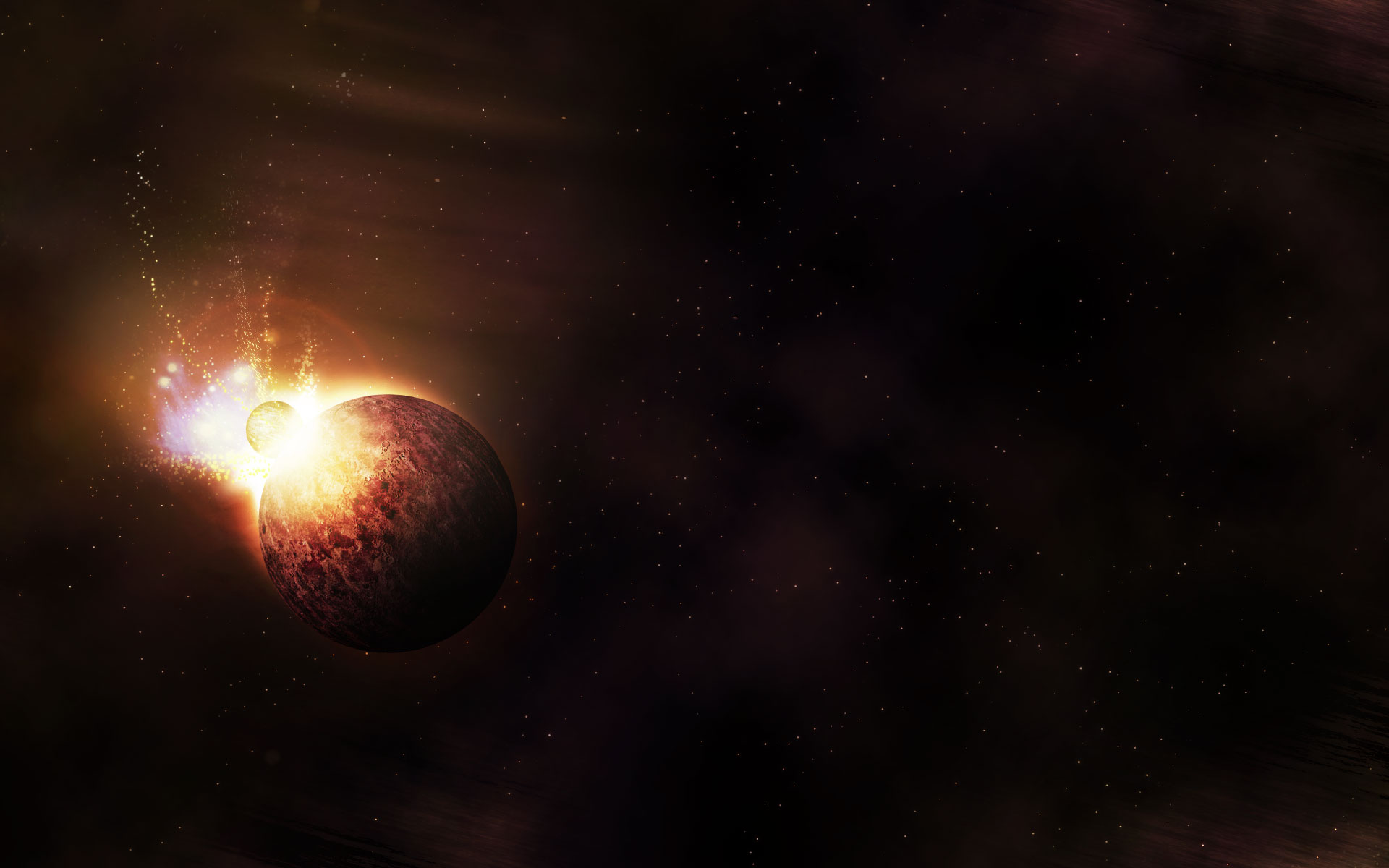
Before we begin, let's take a look at the image we're creating. Click the screenshot below to view the full-size image.
The full 55mb, 50-layer-photoshop file is as always available via our Psdtuts+ Plus membership.

Step 2 - The Rule of Thirds
Before we get to the drawing, first a word on composition. Most of the image is going to be empty space with one main focal point — the planets exploding. Therefore, where we place that focal point is going to be important. I've followed what's known as the Rule of Thirds.
This rule — used in photography, filming as well as illustration — simply states that if you divide your canvas in three lengthwise and vertically, your main focal points should be at the intersections, or along the lines themselves. The reasoning being that having things off center creates more visual interest.
So I'll be placing my planet images in the bottom-left corner. Note that after I placed my actual lines on for this diagram, I realized it wasn't quite on that cross-section, but close enough :-)
Anyhow, for the purposes of this tutorial, I'll be zooming in on the left side so that we can show things a bit closer up without breaking my Psdtuts+ grid, so I thought I should show you the main composition first.


Step 3 — Layers Magazine
Editor's Note: You can download the planet image below by following this link.
I actually started this image yesterday morning after I spotted a link in our user link feed to Layers Magazine's Back Page Design Contest. The contest is to take an image of a planet (see below) and make something with it. There are some great prizes, so click through and enter yourselves! Even if you don't enter you'll want to download the planet image.
(In case you're wondering, I didn't enter the image from this tutorial, because it's becoming a tutorial instead.)


Step 4
Ok, finally we start drawing!!
First, we create a new canvas. Mine is 1920px wide by 1200px high. In a background layer, we draw a radial gradient, with the lighter area roughly where we'll be drawing the explosion (i.e. where the light will be!). It should be pretty subtle, like the screenshot.


Step 5
Now to give our space some texture, we need to render some clouds. Go to Filter > Render > Clouds with a black and dark brown color selected (as shown below). Now if you press Ctrl+Alt+F after you do this, it will render them again but with more contrast. This is useful because otherwise on such a big canvas, the clouds are all a bit too close.


Step 6
Unfortunately, even with the Ctrl+Alt+F version, I still found the need to go through with a large eraser brush and gently brush away some parts. Then we set the clouds layer to Screen and 85% Opacity to let through some of that background radial gradient we did. The final result is shown below. It's a bit hard to see why I did this in this small screenshot, but on a larger canvas the difference is noticeable.


Step 7
Next I grabbed this image from iStockPhoto (see the thumbnail below). I chose it because of the sky pattern, which looked like it would add texture to my scene. I purchased a 9-credit version because I needed the image rather large.


Step 8
Then I pasted the image over the top of my canvas and rotated it so it ran lengthwise. Then we press Ctrl+Shift+U to desaturate the image because I'm not interested in the colors, just the texture. I then grabbed a large, soft eraser and erased most of it. I left a small patch up at the top as shown. (Actually, there's another patch right on the right-hand side of the final image.)


Step 9
Next I set that layer to Color Dodge and 50% Opacity. This gives the result shown, a nice textured effect that goes well with the rest of the image.
Incidentally, I feel I should mention that when I originally made this image, I didn't do all the steps in the order shown in this tutorial. The full thing took about 8 hours for me to complete, and a lot of that is adding something, then taking it away, then adding something else, then realizing that it's clashing with an earlier component and removing that, etc. I've then abridged the process so it sounds really coherent and like I planned everything (which in fact I didn't :-)


Step 10
Now to draw stars we're going to use brushes. There are other methods for drawing stars, notably I demonstrated a really quick and dirty method in the tutorial A Slick Supernatural Text Effect, that uses a noise filter. Unfortunately, this doesn't work as well in a larger image where the stars come out looking a bit too small and evenly spaced.
So instead, grab a paint brush and white as the color, then click on the Brushes tab in the top right and follow the settings shown. There's not much to them except that we want lots of small spaced-out dots.

Step 11
Once I had my "star" brush, I painted all over the place, then grabbed a soft large eraser and erased out some parts. I then duplicated the star layer, turned it 180' and faded it out to 30%. This gives a bit more depth to our star field with some of them not as bright as others.


Step 12
Now I decided after many different experiments that a purple coloring would look best, so I filled a new layer with a purple color and set its blending mode to Overlay. (Note that if you use the Color blending mode, it gives a really harsh and horrible result, so Overlay is definitely the way to go here).


Step 13
So now we have our background sorted (mostly). I then put all those layers into a nice layer group called Background!
Then in a new layer group called Planet, I pasted and resized my planet image that I got from the Layers Magazine site.


Step 14
Now because the explosion is going to be in the top-left area, this is going to be the lightest part of the planet, and the bottom-right will be the darkest area. To lighten the planet, I first duplicated it, then with an eraser erased away all but the top edge. I set this layer to Screen and 50%.
Then I duplicated that layer and erased away a bit more so there is even less of the edge left. Then I duplicated that again, erased a bit more, and then ran a Gaussian Blur (Filters > Blur > Gaussian Blur) on it with a distance of 2px. Then I duplicated that layer and did the same again with a distance of 4px. Then I did that again two more times with 8px and 16px distances. You can see the six layers on the right of the image below and the composite on the left.
I have a feeling I also used the Burn Tool and burned the bottom right a little, but I can't quite remember! In any case, place the planet layer and these latest layers into a subgroup called The Planet.


Step 15
Now we paste in the same planet again, but shrink it so it's even smaller (as shown). This is going to be the comet / planet that will be colliding.
By the way, in case any of your readers are astronomers or astrophysicists, I should point out (in case it's not blindingly apparent) that I'm not striving in any way for realism in this image — just something that looks cool.


Step 16
To make this planet look different from the other one, I've taken the very clever step of making it black-and-white — what a technique! Just press Ctrl+Shift+U to desaturate it.


Step 17
Next I rotated it around and used the Dodge Tool (O) to lighten it all over, particularly the bottom right.


Step 18
Now in yet another layer subgroup which we'll call Planet Highlight. Then Ctrl-click the original planet layer to select its pixels, then create a new layer in the Planet Highlight subgroup.


Step 19
Using the Gradient Tool, we draw a white-to-transparent gradient going from top left to bottom right.


Step 20
Now we duplicate that gradient layer and apply a Filters > Blur > Gaussian Blur with a distance of 1px. Then duplicate again and apply another blur with distance of 2px, and once more with 4px. I set the first layer to Screen, 50%, the second to Overlay, 50%, the third layer to Soft Light, 100%, and the final one to Overlay, 100%.
In case you're wondering why I did this, the repeating gives a nice very soft blur effect, and the various blend modes were selected simply to make it look "right". With an image like this I spend a lot of time trying different things to find the setting that feels the most right to me.


Step 21
Next we create a new layer group called Light, and in it create a new layer. Then grab a large, soft brush and click once with your mouse to get a white glow as shown.


Step 22
Now press Ctrl+T to transform it. Elongate it and squeeze the sides in, then rotate it so it's tangential to the main planet.


Step 23
Now we add an Outer Glow to this layer with settings as shown. When applied to something with soft edges, this just enhances the softness and adds some color to the edges.


Step 24
Next we duplicate that layer and rotate it so it's going away and down as shown. The idea here being to make something that looks like an impact.


Step 25
Now to add some color to our explosion, we grab a large, soft brush again and this time paint a yellow color as shown.


Step 26
Set this latest layer to Overlay, and you should get a result like this shown.


Step 27
Now we duplicate the yellow layer and apply a Filters > Blur > Motion Blur to it to make it go diagonally away from the planet. (Note I just realized the angle setting in the screenshot is a bit off. It should probably be closer to -45 degrees).


Step 28
Then we duplicate that layer, apply a Filters > Blur > Gaussian Blur of about 4px, then do this again (Duplicate + Blur), and then again, and one more time for good luck!


Step 29
On the last version, go to Image > Adjustments > Hue/Saturation, click Colorize and make the layer a reddish cast.


Step 30
This is where we're at now.


Step 31
Next I grabbed another image from iStockPhoto. I chose this image because the glowing lights make for a really great light effect and will make our explosion sparkle.
(I should point out here that I later used this image for some of the stars in the background, though I don't document that in this tutorial.)


Step 32
I pasted this layer into the background set so it sits behind the two planets. Then using a soft eraser, I erased all but the part you see in the image below. This makes it look like lots of particles are being thrown out by the explosion.


Step 33
Now create a new layer set behind the set called The Planet. Call this new set Backglow.
Then Ctrl-click the original planet layer to select its pixels and create a new layer in Backglow and fill the area with white. Then press the left and up arrows a few times to move the white area that direction as shown.


Step 34
Now run a Filters > Blur > Gaussian Blur and blur out the white by about 4px.


Step 35
Set this blurry back glow to Overlay and then duplicate it, blur it again by 8px, move it up and left even more. Then repeat this again but with 16px and even more up and left. You should start to get a purplish light (picked up from the background) coming off the top-left of the planet.


Step 36
Now we'll add some sparks coming up. Basically, I used my "star" brush from earlier except under Shape Dynamics, I set Control to Fade. This means that as I brush it gets closer and closer together.
Then in a new layer I painted a few lines coming together into one place. This looks like sparks flying out and spreading apart. I did this in white.
Then I added an Outer Glow with a yellow color and Overlay set as the glow blending mode. Then I placed this so it looks like the sparks are coming out from the impact.


Step 37
So here's our explosion now — looking pretty cool!


Step 38
Now what photoshop space scene wouldn't be complete without a lens flare :-)
So we create a new layer above the others, fill it with black, and then go to Filters > Render > Lens Flare. Here's mine:


Step 39
Set the blend mode of our lens flare layer to Overlay to get an effect as shown. We want the main flare circle to sit right around the explosion. Most of the others should fade off into nothing.


Step 40
To make sure it fades out, we set Opacity to 50% and then add a layer adjustment and use the Radial Gradient Tool to draw a white to black gradient as shown in the layers palette (Note: ignore the other layers, the screenshot was taken after all layers were created :-)


Step 41
Next I decided to apply a subtle blur to soften the whole image. To do this, Flatten everything down, then press Ctrl+A to select everything and Ctrl+C to copy it. Then go to your History Palette and undo a few steps so it's no longer flattened, and you have all your layers back.
Update: Thanks to Jared in the comments who pointed out a neat command I didn't know, press Cmd+Opt+Shift+E (Mac) /or/ Ctrl+Alt+Shift+E (Win) and you'll create a flattened copy of the image in a new layer above the rest. Thanks Jared!
Next paste our layer over the top of the others, duplicate it, and switch one off. With the other, press Ctrl+Shift+U to desaturate it.


Step 42
Now we could just apply a Gaussian Blur to soften things, but instead I thought we'd use a Radial Blur since it adds to the explosion. So go to Filters > Blur > Radial Blur. From the dialog box, choose Zoom as the method to employ and set the amount to 100%. Then in the diagram position the center of the blur to be roughly where you think the planet will be. You may have to try this step a few times until you get it positioned properly.
You should get something that looks like the screenshot below. I think I may have run the blur filter twice.


Step 43
Now set the blurred layer to Overlay and 20% Opacity. Then grab the other version of the flattened image and repeat the blur process with it (but don't desaturate it). Set this one to 10% Opacity.
The first (desaturated) layer serves to up the contrast a little and dim the colors down. The second serves to brighten the image up and exaggerate the radial blur. You can see in the image below how it looks like light is bursting forth.


Step 44
Next I decided I wanted a bit more noise in my explosion, so I grabbed this paper texture from Bittbox.

Step 45
I pasted it in just above the light layers and erased all but the part you see in the image below.


Step 46
Then I set the layer to Overlay and 75% Opacity. You pretty much can't see the effect, but it adds a bit more layering to the visuals. In a picture like this. it's the subtle details that make the image rock. Also setting to Overlay helps counter some of the lightening I did in the last step.


Step 47
We're almost there now!
To finish the image, I thought another planet / moon would be nice as it would let us reflect the light of the explosion and give the image depth. So I purchased a picture of the moon from iStockPhoto.


Step 48
I used the Magic Wand Tool (W) to select all the black in the moon image, then pressed Ctrl+Shift+I to invert my selection and Ctrl+C to copy the moon part of the image out.
Back in my main image, I pasted the moon in and shrank it down to the size shown.


Step 49
Next I grabbed the Burn Tool (O) and burned the right edge into darkness. I then Ctrl-clicked the moon layer to select its pixels and created a new layer over the top, and drew a Linear Gradient from right to left with black fading to transparent. Together this gave me a darkening of the moon as shown with light on the left. This looks like it's being lit by the explosion.


Step 50
To really make it interact, though, I needed to have it reflecting the same colors. So using the eye dropper I selected an orange from the image. Then I Ctrl-clicked the moon to select its pixels, created a new layer, and with a soft brush painted some orange in a crescent shape facing the explosion. I set this layer to Overlay and duplicated it twice, blurring each time using a Filters > Blur > Gaussian Blur.


Step 51
Finally, to finish the image off, I added some typography over the top as shown. I tried to make it reasonably subtle and used the font Eurostile for its squared off corners that look quite futuristic, but not over-the-top futuristic.
And we're done!! One lovely, large wallpaper for my laptop!
In the next two steps I'll show you two actual inbetween screenshots (as opposed to my manufactured tutorial screenshots), then finally the final image one more time :-)


Actual Screenshot 1
I first started this image yesterday morning, and after about three hours, this is where I was up to. I left it at that and came back today to finish off the image. You can see here I didn't have the highlights on the planet, there are a lot more "sparks" and the image looks a bit more like an eclipse with a darker planet with light behind it. I also hadn't decided to use a purplish coloring and was using a very warm yellow at this point.
Actual Screenshot 2
It's often even more important to know when to stop and remove elements as it is to know when to add things. In this iteration, I was adding some glowing wavy lines to the picture similar to what we did in the super popular Psdtuts+ tutorial Advanced Glow Effects.
When I showed this to my wife, she promptly told me I'd gone too far and was overdoing the image. She was right :-) So I removed the lines and went with the moon instead. I also had a bit of a dumb placing of my text — it's too close to the right-hand side and looks unbalanced with the planet.

Final Image
And so I kept going and wound up with this image. I hope this tutorial has been useful as it took forever to write! Methinks it'll be a while before I attempt another tutorial with 50 steps!


