Add Dynamic Lighting to a Flat Photograph
In Photo Effects by GiackopIn this tutorial I will show you how to spice up a fairly dull and flat photograph. It's very easy and fast! From flat photo to uniquely lighted style.
Source Photos
For this tutorial we'll need two photos that I took, you can grab download them to follow along. These are my photos: castle photo and clouds photo.


What We're Making
Here's the composite we're making, click to see a larger version:
Step 1
First of all, my apologies for this step, I waited for a good 20 minutes but that car didn't move so I had to take the photo with it!
Anyway just use the Patch Tool (J) to remove the car and the Clone Stamp Tool (S) to recreate the pattern of the bricks where it used to be.
If you've never used the Patch Tool, there are a couple of ways to use it. First make a selection as you would if you were using the Lasso tool, then click inside the area and drag with your mouse. Depending on whether you are using Source or Destination as your checked option you will either move the image inside the selection, or move the whole selection around. The Patch tool will blend the area you choose in when you let go. You can also use patterns and transparency. All in all it's a great tool.

Step 2
Once the van has been removed, apply Filter > Render > Lighting Effects to make the light coming from the top right.

Step 3
With the tool that You prefer, create a selection of the part that you want to hide. For example I used the Pen Tool (P) to select the sky and the buildings around the castle. With the selection active Add a Layer Mask.

Step 4
Duplicate the Background Layer, desaturate it with CTRL-SHIFT-U, apply Filter > Blur > Gaussian Blur with 4 pixel radius and set the Blending Mode for the Layer to Overlay.

Step 5
Now we need a photo with clouds and the rays of the sun coming from the right. I used this photo of mine that was perfect for this situation.
Send it to the back of the other layers.
Than duplicate it and set the copy layer to Lighter Color.

Step 6
Duplicate again the original background photo (Layer 1) and put the this new layer before the Layer 1 copy.
Set the Blending Mode to Multiply.

Step 7
Now turn off the visibilty of the two castle layers, go to the Layer 1 copy and merge the visible in a new layer with CTRL-SHIFT-ALT-E.
Than desaturate it with CTRL-SHIFT-U, set the Blending Mode to Overlay and the Opacity to 50%.

Step 8
Make a new layer on the top of the other.
With a Large White Soft Brush, matching the size of the light of the sun, just make a round spot.
Than apply the Luce filter that you can download freely or use the previous tutorial about Lighting Through Clouds here on PSDTUTS, to make this light coming through the clouds. Set the Blending Mode to Overlay.
This is an example with black background to demonstrate the effect.

Step 9
Just Burn the dark side of the castle and Dodge the light part of it with a Large Soft Brush. By doing this we make it seem that the light is coming from the clouds and hitting the right side of the castle, leavin the other side in darkness.
At this point we're almost done but the image is overall quite dark and our blur earlier has left it slightly too blurry, so we'll fix that next.

Step 10
To finish the image, create a new layer above the rest and go to Image > Apply Image, use the settings "Merged", "RGB" and "Normal" for blending. This will create a new layer above the rest holding a copy of the image. Set this layer to Screen and about 70% opacity. Then go through each layer and apply Filter > Sharpen > Unsharp Mask and use the settings Amount: 250% and Radius .2px (Use a larger radius for larger images). This should sharpen the image back up to give us a good final result.
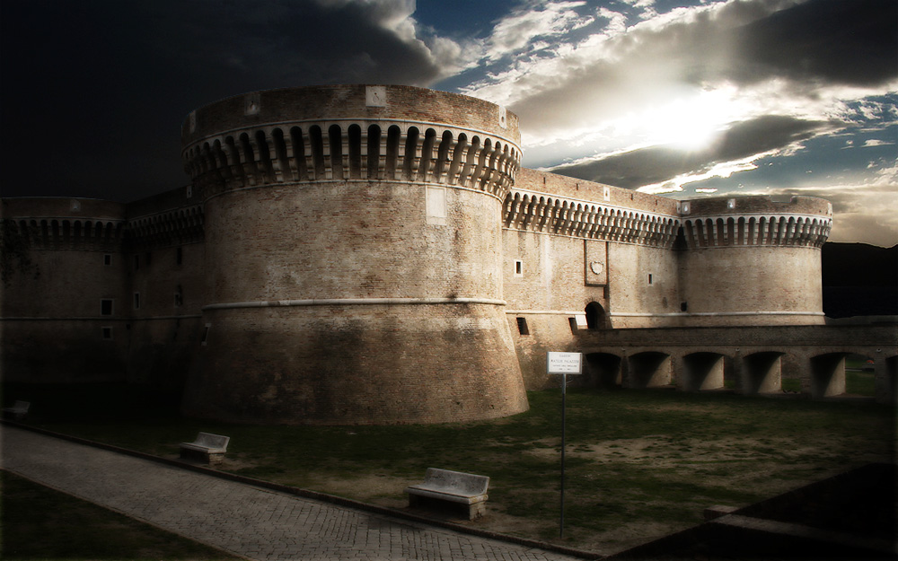
Click on the image below to see a larger version:
Comments
Leave a CommentAdd a Comment


Coolguy
March 19th, 2008
this is pretty cool!
skut
March 19th, 2008
wow amazing, that pic look really good
and LOL about car
another great tutorial
Ibrahack
March 19th, 2008
excellent! very nice effect!
tom
March 19th, 2008
oh my god!!!!
worse than ever,this is the worst post ive seen on this site,
i mean something this simple you guys puttin it up!? wow!!! i thought collis doesnt post every tutarial just good ones…
….iam really disappointed
Alen
March 19th, 2008
Simple but very good.
Andrei Constantin
March 19th, 2008
That’s more like it. You guys should post more and more tuts in Photo Effects section
Yo
March 19th, 2008
Tom if you dont like it dont comment it. I appreciated this alot and I garantuee that a whole lot of other people will to. Not everyone is a photoshopmaster. Thanks for a great tutorial!
chandan
March 19th, 2008
cool
arnaud
March 19th, 2008
Thx for this tutorial
Giacomo !
Shane
March 19th, 2008
An interesting effect that’s quite easy to accomplish. Thanks for the tutorial.
OwlBoy
March 19th, 2008
@Yo, why have comments if all people can do is say they like it? People can express their opinions on the tuts no matter what they might be in my opinion.
That said, I like this tutorial
-Owl
giackop
March 19th, 2008
yes!!! i love you guys thanx!!!
Lamin Barrow
March 19th, 2008
Thx man. That is an amazing trick.
reader
March 19th, 2008
The lighting effect isn’t very realistic, the front of the caste is beïng lighted while the sun is after the castle. This is a bit against nature… Maybe something you should take into account.
Constantin Potorac
March 19th, 2008
Hey there giackop,
I was really looking forward for this tutorial. Congrats. ;P
VectorCars
March 19th, 2008
Very good! Thanks Giacomo Coppola.
Markus
March 19th, 2008
It looks like a HDR photo!

Keep it up!
Terry
March 19th, 2008
awesome. you should put up more photo effects tuts, since not all of us really want to design web stuff..
coolness.
jo
March 19th, 2008
great!
Jan
March 19th, 2008
Cool tut! Please post more like that. You know … for pepping up dull photos.
AC
March 19th, 2008
Nice effect, shame the clouds aren’t in the same perspective as the castle though.
Nono
March 19th, 2008
C’mon,
Thanks for posting it but this kind of tutorial is a “viewed a thousand times” and honestly the result is not so nice.
The all image is blurry and darkish, there is way to much diffusion and i don’t see why using an external plug-in just to add some lighting ? And talking about lighting it seems odd to have the front of the castle so bright when the sun is on the other side , uh ?
As for “Yo” who tells people that they only have to post comments to say “hey, great, awesome, cool, i love it, you’re the best” i should ask him if he’d like to live in a country where your only right is to agree with everything…
Nono.
Cain
March 19th, 2008
Very cool, really adds depth and shading to the picture.
Mark H. Abucayon
March 19th, 2008
great tut again its very simple but useful. good job.
Flaunt
March 19th, 2008
Please ban Tom!!!! Im starting a petition. Anyone in favor of banning Tom from this site?
J. Arthur
March 19th, 2008
Nice. Just because it is a simple tutorial does not make it bad. Good work : ) I agree this photo does have an HDR look.
Juanjo Vargas
March 19th, 2008
seems like hdr, nice tut
LOSWL
March 19th, 2008
Very Cool Tutorial, I saw the photo on your site a while back and had no clue that so much Photoshop work went into it!! :oo….very dynamic image!! and great to learn some of those techniques which can be applied to other areas of design :o) thanks!!
b00m
March 19th, 2008
very nice effect
Katalog Stron
March 19th, 2008
Simple but effect is great.
jguiss
March 19th, 2008
Yes ban Tom !
Snubbed
March 20th, 2008
I loved this tut. It’s not terribly complicated, but it’s certainly not a beginner tut, either. Very happy to see this. More photo effects, please. As for obnoxious commentators - they betray their ignorance and laughable stupidity with their own words. Welcome to the English language, T-boy.
Joel
March 20th, 2008
Don’t ban Tom, that’s censorship. Dissenting opinion is valid. You may not like them, but they are still valid. Calling for a ban smacks of a police state.
Anyway, great tutorial. Where’s this castle located?
Leyre
March 20th, 2008
Another simple yet useful tutorial. Thank you very much guys.
And yes, ban Tom.
Ben Griffiths
March 20th, 2008
This is a nice effect, and the result looks great, thanks!
tom
March 20th, 2008
after all PSDtuts.com is a great website
Alberto
March 20th, 2008
Why should you ban Tom?
Isn’t his opinion as important as yours?
@Yo: “Tom if you dont like it dont comment it.”
this is simply ridiculous!
Just my 2 cents.
sct
March 20th, 2008
Really awesome tutorial. Its quick and you get an awesome effect!
giackop
March 20th, 2008
Ehy guys thanks everybody again!!
Anyway this castle is from Senigallia (a small town in the center of Italy, where I live).. If any of you are interested you can check the flickr group (http://www.flickr.com/groups/senigallia/)..
bweb
March 20th, 2008
Not bad tut
–
But I really do not understand why someone (@Tom) should be banned for writing what he thinks…
rob
March 20th, 2008
Looks great … I love these effects. Thanks for the tut and keep up the good work.
www.kamilos.net
March 20th, 2008
the ligtning is totally messed up :/ the front of the castle should be in the shadow according to the sun position or there are two suns in the sky
LOL!
Sean
March 20th, 2008
Ban TOM! Wow what a jerk. Very cool tut and easy to follow, I appreciate it since I am looking to do more photo effect work. Thanks!
Lies
March 20th, 2008
This may be an easy tutorial (if you’re more experienced in Photoshop), but it is very helpful. I hadnt yet thought to touch up those lighting-wise bored photo’s like this. Thanks for the tutorial!
Jim
March 20th, 2008
Can anyone else appreciate that there are 1337 photos in the flickr group?
Jessica
March 20th, 2008
Stunning!
dario
March 20th, 2008
interesting tutorial!
www.dariobologna.com
www.flickr.com/photos/dariobologna/
Fredro
March 20th, 2008
Tom is obviously just a troll. It comes with the territory once a site becomes popular.
Nice, simple effect btw.
Constantin Potorac
March 20th, 2008
Good work giackop,
This is a very great effect so whatever Tom or anyone else says just know that this effect is very useful for others and that Collis did a great thing for accepting it.
Keep up the good work and maybe we will see more tutorials from you.
First tutorial from you and a really great and useful one.
f0ox
March 20th, 2008
www.alltutorials.ru - уроки фотошоп, уроки photoshop cs3, уроки по фотошопу
Jonny
March 20th, 2008
An interesting tutorial, nice effect, thanks for the tutorial keep it up.
v1ktor
March 20th, 2008
loving all the tutorials
great jobbb
JokR
March 20th, 2008
I kinda agree with everyone that says this tutorial shouldn’t be here . . . It’s a very simple effect achieved in less than 5 steps (the other steps are just for prepping the picture and minor settings) that implies the use of simple elements that everyone knows where they are and what they do. This site used to bring more advanced tutorials and that’s why I liked it a lot. But anyway the presence of this tutorial here doesen’t bother me and also I think that it shouldn’t bother anyone because afterall beginners must also learn.
RP
March 20th, 2008
JokR, this is the perfect kind of tutorial for newbies to Photoshop. Remember, not everyone has used Photoshop for years, or has a detailed knowledge of the program. I like it, maybe not for the quality, but simply for the fact it creates an interesting effect that is easy to replicate.
Cheers Giackop!
goldenthunder
March 20th, 2008
haha jim - sweet! or 5w337 i mean lol great tut by the way!!!
scmtngirl
March 20th, 2008
Nice tutorial, but bad choice of images. As pointed out before, the lighting doesn’t make any sense. If the sun wasn’t visible in the background image but it was instead obvious that the sun was placed just out of the frame and still lit up the clouds, it would work perfectly. I love psdtuts, though! Great stuff. Very inspiring.
tom
March 20th, 2008
guys im just saying what i think why should you ban me!?
it is america freedom! freedom of speech
So STFU whoever said ban me,butta thanks everybody else who didnt mind me sayin what i think
in my opinion Collis and Fabio are another 2 of Best photoshoppers i know…we should see more from them
but for free not for money cuz nobody buys that… if you guys want to make some money get some ad here, thats all.
Thank you
Mr Dave
March 20th, 2008
I for one do not have a problem with people giving feedback either way, I think it makes the designer stronger when people give suggestions. I would however say that “how” you give feedback can be important.
Unfortunately some methods of providing feedback are not well thought out or professional. It will only undermine what they are trying to express and ultimately make their comments null, as no one will take them seriously.
I think while there are certainly some logistical issues with the composition, specifically around the source lighting and perspective, I personally find it enlightening to see how others use Photoshop to accomplish their final product.
If I take one thing away from any tutorial, even if that one things is “not to do something”, then would you not consider that a “win”? I now know that if I try to apply lighting effects to a building to ensure that I pay careful attention to where I place my light source VS the reflection.
Overall, this is nice job, to the ordinary viewer (people who do not use Photoshop or composite) this picture would do fine up against the average consumer if used on some sort of design.
Tiago
March 20th, 2008
Muchos nicos punk!
I have to say that I agree with the sun and lighting issue, and I hope those comments can be helpful to you, but we all know that at the end that’s not the focus of the tutorial.
What is important is that you showed us how to get something beautiful accomplished in a very simple way. Excellent tutorial.
Cheers my friend!
Michael
March 20th, 2008
oh no, opinions! oh my!
Fire
March 20th, 2008
It’s probably worth pointing out that the could image isn’t a photo, but instead a Terragen render.
KhanIstikhar
March 20th, 2008
Hey Guys ur work is Ausome i just want the psd layered file.
Thanks
julius
March 21st, 2008
great job… l
giackop
March 21st, 2008
@fire: dude the cloud photo is indeed a photo i made in norway two years ago..
here the flickr photo http://www.flickr.com/photos/giackop/347950834/ on the bottom left you can see the border of the boat.. so it wasn’t worth to point out something that it’s not true..
anyway i hope you liked the tutorial..
bratwurst
March 21st, 2008
nice concept, but overall way to dark
Drew
March 21st, 2008
Are you from Senigallia??
Swany
March 22nd, 2008
great tutorial! thanks!
giackop
March 22nd, 2008
@drew: yes i am.. you too?
Swany
March 23rd, 2008
Just finished mine with a few of my own photos…
my pic here
Thank you for the tutorial!
Swany
cheng
March 24th, 2008
hey tom
if you think collis and fabio are the best, but aren’t willing to pay, how can they continue to be the best? Can everyone just give up large amounts of time for free to help random people who aren’t grateful for it? Think about it. And Collis already explained ads don’t work, so forget mentioning that.
@fire
LOL. maybe you spent too much time in terragen, but this is certainly not anything achievable by computer yet.
Spencer
March 25th, 2008
Beautiful final product!
GNP
March 26th, 2008
Giacko!
Keep up the good work. Your simple tutorials are key for phtoshop amateurs like me that want to have an edge without ambitioning becoming a pro.
Good luck with your designer career.
Hugs from PT
Rob
March 26th, 2008
Thanks for this tutorial. It’s great having a step-by-step guide from Photoshop experts.
John
March 26th, 2008
Ok people who are unhappy with this tutorial … give me a break! It’s meant to be artistic.
Too Dark?? C’mon… it’s supposed to moody!
Too blurry?? C’mon…It’s supposed to be ethereal!
A little know film called…. wait for it… “THE 300″ ( for cryin’ out loud ) used the EXACT SAME EFFECT!!!
Look through the movie pics and see for yourself.
http://media.movies.ign.com/media/040/040983/imgs_1.html
Loved the tutorial myself… great stuff I will use.
teh pwn
March 26th, 2008
hey
great tut
its ture some people think this is rather simplistic
but in true essence, not all of us are pro photoshoppers
keep that in mind
but good job on the tut

oh, and does this remind anyone else of the movie 300
i swear thats the first thing i thought of
Meta
March 26th, 2008
It’s ridiculous for people to say this shouldn’t be here. As has been already pointed out not everyone is a photoshop genius. And yes there are other sites with tutorials about this kind of thing but how many of them are as brilliantly done as this? Everyone is entitled to their own opinion, if you don’t like it, say what you don’t like in a constructive way. Don’t just denounce the tutorial as useless because it will always inspire and help someone else.
Personally I loved it and haven’t really worked with photos and will be trying this out. Thanks!
internet & web design blog
March 27th, 2008
real slick effect - i love psdtuts and can’t wait for more tutorials
hi
March 27th, 2008
nice tut, but the lightning seems wrong to me. from the height of the sun and the clouds, the lighning should come from behind the castle and the front area should be darkened. no it looks like the sky is direktly on top of the castle. but maybe just got wrong eyes
keep on with good tutorials!
Daniel
March 27th, 2008
excellent!
Constantin Potorac
March 29th, 2008
Yup… Giackop, Great job. Don’t mind the bad guys :))
Bendikt Myklebust
March 30th, 2008
This is TO blurry :/
Jenny
April 4th, 2008
oh wow that’s awesome. i’m totally gonna try this out.
Haris Siddiqui
April 5th, 2008
With all due respect,
Screw all you people who wine abt this and cry abt tht. For Christ sake let PSDTUT do their Job and post what ever they think is reasonable. I have kept quite for a long time but now every time i read such comments they get on my nerves.
As for PSDTUT, keep up the gud work. All your Tutorials have been useful for me in one way or another, every tutorial you put up is unique in its own sense.
Thanks - & My Apoligies if i just offended any one in here….*Wink*
Jack
April 10th, 2008
Very cool indeed. Thanks!
ploy
April 18th, 2008
awesome!
Qbrushes
April 24th, 2008
i know everyone mentioned how the lighting is all wrong.. but i like it
good work
Rybaxs
April 26th, 2008
i love the style… yeah!
Dario
May 2nd, 2008
That’s crap, the light is wrong, the shadows are wrong(is too dark on the left to be daylight, and you clearly see you cut very bad and the top of the nearest tower, and the Step 8 in completely useless, why I have to download a Light filter, when I can do that with the brushes? this tutorial is so bad sorry
TH
May 14th, 2008
Pretty cool effect.