


One of the best sites around for desktops has to be Desktopography. I've been inspired by their amazing work, so today we are going to put together a sunset image mixing some vector shapes and dusky lighting effects to produce a slick image that would make a nice album cover for a chillout mix!
Steps and Assets
As always you can download the PSD file to follow along at the bottom of this tutorial. It's a pretty large file so be warned! Additionally we are using a few assets including a photo from iStockPhoto and some vectors from Arsenal's Freebie Section. Note that in the sample PSD, I've merged some text onto the original image to protect its copyright since it's such a large copy.
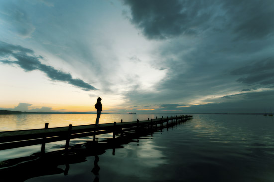
Step 1:
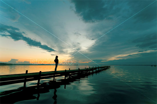
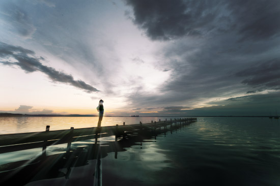
So here's our original photo from iStock. It's a pretty gorgeous photo with great sunset lighting and contrast for us to build on.
Step 2:
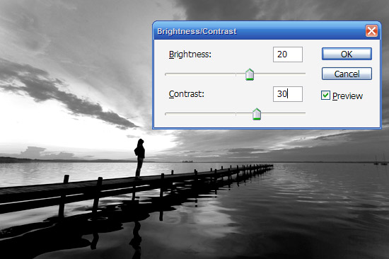
First off we duplicate the photo, press Ctrl-Shift-U to desaturate the image to Black and White. Then go to Image > Adjustments > Brightness/Contrast and make the image a bit brighter and contrastier as shown.
Step 3:
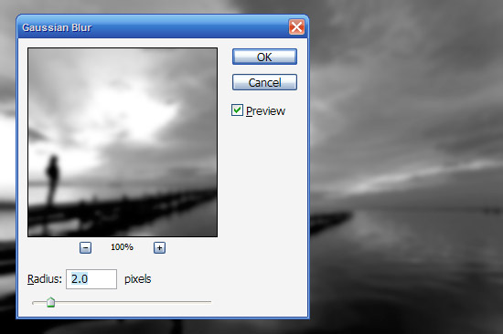
Now go to Filters > Blur > Gaussian Blur and apply a mild blur of 2px.
Step 4:
Now we set the blurred black and white layer to blending mode Overlay and Opacity 50%. This gives us a slightly surreal blurring on the image. BE WARNED: This effect (blurring then overlaying) is a bit of favorite of amateurs, so go easy on it. When you do use it, make sure you fade it out a reasonable amount so it doesn't look too tacky.
Step 5:
Now the lighting is pretty nice already, but I'd like some pinkish hues in the image as it makes the image a lot warmer than bluish colors.
So in a new layer, use the Paintbucket to fill with a bright pink color. Then use the Eraser Tool with a large, soft brush and remove some areas where you don't want as much pink to shine through (this was pretty arbitrary for me and just gives the image more depth rather it being uniformly colored). We then set the blending mode to Color and 20% Opacity. Actually I did those two steps the other way around (I blended first then erased the bits I didn't want).
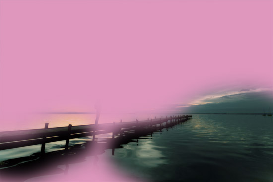
Step 6:
Here's the image after adding the pink.
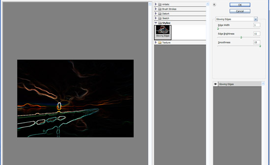
Step 7:
Now to make the sun rays, we are going to use a combination of glowing edges and radial blurring. So duplicate the original colored layer and put it on top of all the other layers. Then go to Filter > Stylize > Glowing Edges and use settings of 1, 11, and 15 respectively for Width, Brightness, and Smoothness.
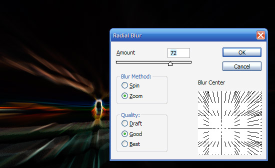
Step 8:
Now we go to Filter > Blur > Radial Blur and apply settings as shown. Make sure that you have set the blur method to Zoom (not Spin). Also importantly move the Blur Center until it's roughly in the position of the image where the woman was standing, i.e. where the 'sun' is going to be. You may have to do this a couple of times to get the positioning exactly right because it's a bit trial and error.
Once you've got it, apply the Radial Blur again by pressing Ctrl+F (to repeat the last filter used).
Step 9:
Now set the blending mode for this layer to Screen.
Screen blending mode basically knocks out darker colors to only leave the lighter ones. This is the opposite to Multiply which knocks out any lighter colors and just leaves darker ones. This is really handy for when you have say a logo on a white background and you want to apply it to an image but don't want to cut it out - instead you just set it to Multiply (or Screen if it's on black).
Step 10:
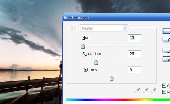
To get the light looking more like sunlight, we go to Image > Adjustments > Hue/Saturation and tick the box that says Colorize to add some more color to the light rays. Then move the sliders around until you get a reddish tint and press OK.
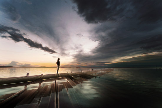
Step 11:
Now repeat the process (Glowing Edges > Radial Blur > Screening the Image) a couple of times to get more light rays as shown. Try moving the Radial Zoom filter around a little to get different casts of light to mix together.
Also as you add extra layers on you can always use the Eraser tool to remove some parts of a layer and leave others so that they blend together well. This is generally a matter of playing around with the image until it looks right. Also note that you can use Layer Masks to do this without losing any image data, but because I never used Masks when I was learning Photoshop, out of habit I still do things the old (and probably a bit dumb) way :-)
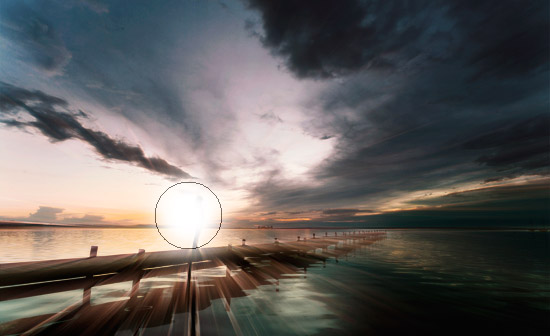
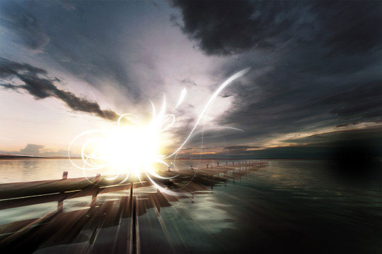
Step 12:
Next we want to add the big glowing center to the image. So create a new layer on top of all the others and get a large, soft brush and with White as your foreground color paint a blob of white over where the woman's silhouette is.
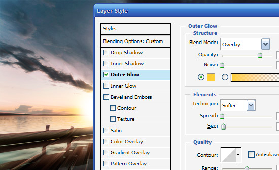
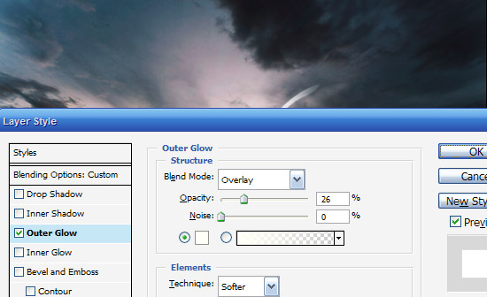
Step 13:
To this blob of white, we now add an Outer Glow of yellow set to Overlay (as shown). You can do this by right clicking on the layer and selecting Blending Options.
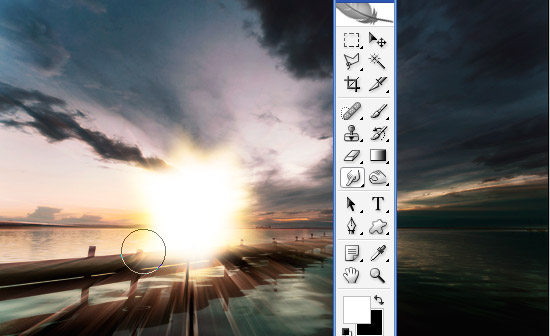
Step 14:
Now in your tools palette choose the Smudge Tool (R) which you can see in the image. Using your mouse, smudge your ball of light outwards. Note that in the image shown, I've done some pretty big smudges so you can see roughly what we're doing, but in reality you should make smaller, more subtle smudges.
What you are trying to do here is give it a burst of light feel. You might want to duplicate the layer and have a couple of them together which is what I've done in the sample PSD.
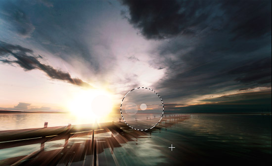
Step 15:
Now what sunset would be complete without a lens flare? Rather than using the filter though just create a new layer on top and draw a circle as shown and fill it with white. Set it to blending mode Overlay and about 10% Opacity. Then create a new layer and do the same with a smaller circle and repeat again a couple of times until you have a subtle lens flare as shown.
Then merge the layers together and set it all to about 30% because we want this to be really subtle!
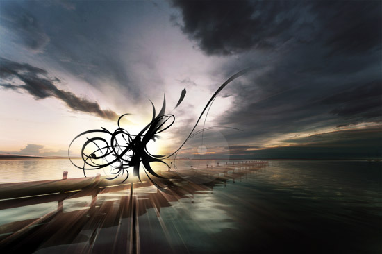
Step 16:
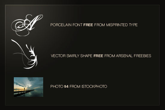
Now in new layers we paste in some of our vector images. I've used a sort of swirly wing thing from Arsenal's Freebie Section and also the capital letter A from a font called Porcelain, which you can get from Misprinted Type for free.
I chose both because they have lots of lines and swirls which fits what I want to do. I also duplicated the swirly wing vector, flipped it by going to Edit > Transform > Flip Horizontal, then Ctrl+T to scaled it down in the transform menu. That way its good for little details.
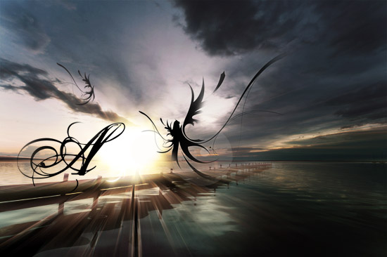
Step 17:
Now fit the three images together as shown. When we switch them to white, we want most of the objects to be obscured with just bits of swirl poking out the edges.
Step 18:
So now for each layer we press Ctrl+I to invert the color from Black to White and then right-click the layers and select Blending Options. Then we add an Outer Glow as shown to make them fit in with the main ball of light.
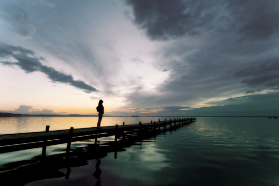
Step 19:
You should now have something that looks like the image below.
Step 20:
Now for the final touches, I've added some text using the font Chalet which is wonderfully elegant but isn't too over the top. Note that you might feel tempted to add a swirly, cursive type font for text, but this would be overkill. It's much better to contrast the complexity of the main image with a very simple and understated type treatment (in my opinion). Anyhow as you can see I've placed it near the center of the image.
Looking at the final image, I also decided it needed a little more color so I added a layer at the very top filled with a reddish color (#957070) and set it to Overlay at 30%. This warms up the image a little more, and you'll see that layer in the final shot.
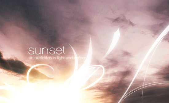
Final Image:
And finally we're all done. Click the image below for the high-res version of our finished product!

Sample PSD


