

Some time ago I came up with a technique to create digital smoke using the Liquify filter in Photoshop. Although it was a simple and efficient way to achieve that sort of effect, people sent me emails asking how to customize it or that it wasn't so easy to follow.
In this tutorial we are going to show you how to easily create digital abstract smoke using both Illustrator and Photoshop. One of the best things about this technique is that it's very customizable and you can do it pretty quickly.
As I said before, we will use Illustrator a bit, but actually you can use whatever vector software you have. The only requirement is that it have a similar tool to the Blend Tool in Illustrator.
Step 1
Open Illustrator, and using the Pen Tool (shortcut: P), draw two different curved lines, try to make them cross each other like the ones below. Those will be the shape of our smoke. After that, do the same thing again and draw two more lines. From those two pairs of lines, select one pair, and set the stroke color of the first line white and the other with dark gray(70%). Repeat the same thing on the other pair of lines but invert the colors. The reason we do this is because when we import those shapes in Photoshop we will be able to tweak the colors with a lot more ease.

Step 2
Using the Blend Tool, click on the edge of the white line and then click on the edge of the gray line. It will create a line between the two lines. With the Blend Tool selected, go to Object>Blend>Blend Options. There, change the Spacing to Specified Steps and put 200 steps. Repeat the same procedure on the other pair of lines we have.
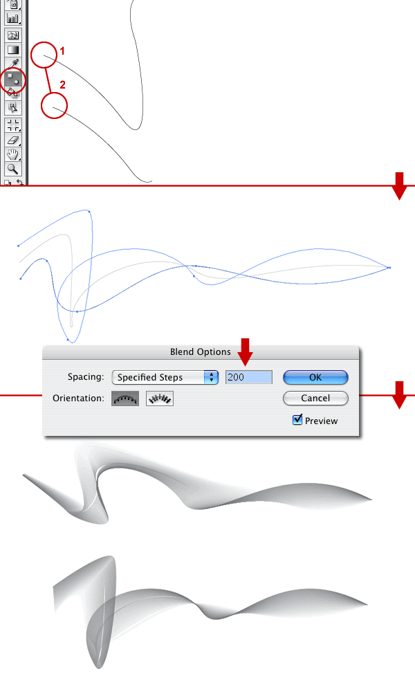
Step 3
Now it's all Photoshop from here. Copy the first blend and paste it in to Photoshop as a Smart Object. Repeat that for the second layer. We choose to paste as Smart Objects because you can scale and re-scale without losing quality. This happens because they remain vectors rather than becoming bitmap graphics. Besides that we can edit the vectors again, and if you are using the CS3 version it's possible to apply all filters in a non-destructive mode as well. That means if you apply any filter you will be able to change their parameters anytime or even delete the filter effect returning to the original image. This is not dissimilar to Layer Styles except now with filters.

Step 4
Here I just organize my layers using folders. Set the blending mode to Multiply for both folders: Shape 1 and 2. After that apply a Gaussian Blur with a radius of 1 pixels in both layers: Smoke 1 and 2.

Step 5
Duplicate both layers inside of each folder. So you will have Smoke 1, Smoke 1 Copy, Smoke 2, and Smoke 2 Copy. Change the Blending mode of the Smoke 1 Copy and Smoke 2 Copy to Overlay

Step 6
Now we are going to change the color from that grayish tone to a blueish one by creating a new fill or adjustment layer and choosing Hue/Saturation. Put that layer on top of the others and double-click on the layer to edit the Hue/Saturation parameters.

Step 7
Duplicate the Smoke 1 layer and Rasterize it. Then put it on the top of the other layer, even above the adjustment layer. After that change its blending mode to Color Dodge and apply a Gaussian Blur with the radius of 25 pixels. You will get a light blue color like a glow.

Step 8
Now we have the basics. We could stop here and have a great effect already, but let's take it to the next level. It's time to add some extra wafts. First fade Smoke 1 back to about 50% so it's a little softer. Then duplicate the Smoke 1 group and fade right back to 20%. Select the group and add a Layer mask. Then using a White to Black radial gradient, mask it out as it gets to the right side so the smoke is fading off into nothing.

Step 9
Next duplicate the same fading out smoke layer we made in the last step and rotate it to make it look a bit more random. If you had time you could replicate these layers from the very beginning steps in Illustrator. Your aim should be to have wafts of smoke going away from the main smoke channel. If you want a smoke on white effect, you should stop here.

Step 10
Next create a new layer above all the others and fill it with a gradient going from white (#FFFFFF) to grey-ish blue (#C4CCD0) as shown.

Step 11
Set the new layer's blending mode to Exclusion. Exclusion (as well as Difference) invert colors from lower layers, which gives us a smoke on dark-grey effect.

Step 12
The coloring is now pretty cool, but it could be even more graceful. Create a new layer above the others and fill it with a linear gradient from #5f4547 to #7096e4 as shown. Once you have the gradient, set the blending mode to Color and 50% Opacity.

Step 13
Finally we add a bit of text to finish off the image. This effect is best when you create it larger than you need at the end, then shrink it down and run the Unsharp Mask filter over it (Filters > Sharpen > Unsharp Mask) to get the curves looking clean and crisp.

Conclusion
Using Illustrator's Blend Tool gives a lot of flexibility so it's possible to create all sorts of shapes and blend them, even creating blends with four different shapes. Then in Photoshop with the Smart Objects and Smart Filters we can apply, change, and test all kinds of filters and combinations. It's all about playing with the tool.
As Bert Monroy always says, I hope you have learned something from here and it's not the end result but how we got there. Thanks
Sample PSD


